-
-
Notifications
You must be signed in to change notification settings - Fork 6
Show a Before and After view of the raw code and rendered code #2
Comments
|
So right now we're showing:
I'm not sure I understand how you suggest it should be instead, can you please elaborate/rephrase? |
||||||
|
I was thinking...
I was also thinking of a "Compare Previews" button that would:
Comparing mobile view versus mobile view might require us to rethink the center divider's functionality in this state. Or optionally just include another button for toggling container width for both views. |
|
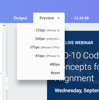
Oh, right! Yeah, I'm on board with that 👍 I wouldn't add a button to toggle these on though, I want the UI to be as clean as possible. Users can simply click the tabs. Scroll is very likely to be reset by previous actions anyway, so I wouldn't bother matching scroll position on tab change; instead, scrolling one preview tab would sync scroll with the other, which would basically do the same thing - just only when user interacts. Regarding mobile previews, I am thinking of a dropdown in the preview tab, where you select a screen size. Selecting a size would simply change the iframe width. I imagine something like this: The dropdown would show up only if the tab is already active. I also wouldn't sync iframe size change between the previews initially - that can be an option later down the road, in a Settings area (where we can also provide option persistance controls, as mentioned in #5). |


Considering all of the transforming that's going on here there's a chance of unforseen/unwanted changes. I think showing the user their original raw code and rendered code side-by-side with the transformed code could help people identify issues with their selections.
The text was updated successfully, but these errors were encountered: