|
1 | | -# Storybook Addon Kit |
| 1 | +# Storybook Addon Cssresources |
2 | 2 |
|
3 | | -Simplify the creation of Storybook addons |
| 3 | +Storybook Addon Cssresources to switch between css resources at runtime for your story [Storybook](https://storybook.js.org). |
4 | 4 |
|
5 | | -- 📝 Live-editing in development |
6 | | -- ⚛️ React/JSX support |
7 | | -- 📦 Transpiling and bundling with Babel |
8 | | -- 🏷 Plugin metadata |
9 | | -- 🚢 Release management with [Auto](https://github.com/intuit/auto) |
10 | | -- 🧺 Boilerplate and sample code |
| 5 | +[Framework Support](https://github.com/storybookjs/storybook/blob/master/ADDONS_SUPPORT.md) |
11 | 6 |
|
12 | | -## Getting Started |
| 7 | + |
13 | 8 |
|
14 | | -Click the **Use this template** button to get started. |
15 | | - |
16 | | -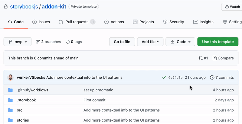 |
17 | | - |
18 | | -Clone your repository and install dependencies. |
| 9 | +## Installation |
19 | 10 |
|
20 | 11 | ```sh |
21 | | -npm install |
| 12 | +yarn add -D @storybook/addon-cssresources |
22 | 13 | ``` |
23 | 14 |
|
24 | | -### Development scripts |
25 | | - |
26 | | -- `npm run start` runs babel in watch mode and starts Storybook |
27 | | -- `npm run build` build and package your addon code |
28 | | - |
29 | | -## What's included? |
30 | | - |
31 | | -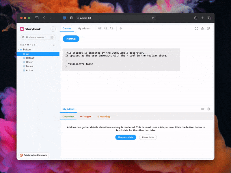 |
32 | | - |
33 | | -The addon code lives in `src`. It demonstrates all core addon related concepts. The three [UI paradigms](https://storybook.js.org/docs/react/addons/addon-types#ui-based-addons) |
34 | | - |
35 | | -- `src/Tool.js` |
36 | | -- `src/Panel.js` |
37 | | -- `src/Tab.js` |
38 | | - |
39 | | -Which, along with the addon itself, are registered in `src/preset/manager.js`. |
40 | | - |
41 | | -Managing State and interacting with a story: |
42 | | - |
43 | | -- `src/withGlobals.js` & `src/Tool.js` demonstrates how to use `useGlobals` to manage global state and modify the contents of a Story. |
44 | | -- `src/withRoundTrip.js` & `src/Panel.js` demonstrates two-way communication using channels. |
45 | | -- `src/Tab.js` demonstrates how to use `useParameter` to access the current story's parameters. |
46 | | - |
47 | | -Your addon might use one or more of these patterns. Feel free to delete unused code. Update `src/preset/manager.js` and `src/preset/preview.js` accordingly. |
48 | | - |
49 | | -Lastly, configure you addon name in `src/constants.js`. |
50 | | - |
51 | | -### Metadata |
52 | | - |
53 | | -Storybook addons are listed in the [catalog](https://storybook.js.org/addons) and distributed via npm. The catalog is populated by querying npm's registry for Storybook-specific metadata in `package.json`. This project has been configured with sample data. Learn more about available options in the [Addon metadata docs](https://storybook.js.org/docs/react/addons/addon-catalog#addon-metadata). |
54 | | - |
55 | | -## Release Management |
56 | | - |
57 | | -### Setup |
| 15 | +## Configuration |
58 | 16 |
|
59 | | -This project is configured to use [auto](https://github.com/intuit/auto) for release management. It generates a changelog and pushes it to both GitHub and npm. Therefore, you need to configure access to both: |
| 17 | +Then create a file called `main.js` in your storybook config. |
60 | 18 |
|
61 | | -- [`NPM_TOKEN`](https://docs.npmjs.com/creating-and-viewing-access-tokens#creating-access-tokens) Create a token with both _Read and Publish_ permissions. |
62 | | -- [`GH_TOKEN`](https://github.com/settings/tokens) Create a token with the `repo` scope. |
| 19 | +Add following content to it: |
63 | 20 |
|
64 | | -Then open your `package.json` and edit the following fields: |
65 | | - |
66 | | -- `name` |
67 | | -- `author` |
68 | | -- `repository` |
69 | | - |
70 | | -#### Local |
71 | | - |
72 | | -To use `auto` locally create a `.env` file at the root of your project and add your tokens to it: |
73 | | - |
74 | | -```bash |
75 | | -GH_TOKEN=<value you just got from GitHub> |
76 | | -NPM_TOKEN=<value you just got from npm> |
| 21 | +```js |
| 22 | +module.exports = { |
| 23 | + addons: ['@storybook/addon-cssresources'], |
| 24 | +}; |
77 | 25 | ``` |
78 | 26 |
|
79 | | -Lastly, **create labels on GitHub**. You’ll use these labels in the future when making changes to the package. |
80 | | - |
81 | | -```bash |
82 | | -npx auto create-labels |
83 | | -``` |
84 | | - |
85 | | -If you check on GitHub, you’ll now see a set of labels that `auto` would like you to use. Use these to tag future pull requests. |
86 | | - |
87 | | -#### GitHub Actions |
88 | | - |
89 | | -This template comes with GitHub actions already set up to publish your addon anytime someone pushes to your repository. |
90 | | - |
91 | | -Go to `Settings > Secrets`, click `New repository secret`, and add your `NPM_TOKEN`. |
92 | | - |
93 | | -### Creating a releasing |
94 | | - |
95 | | -To create a release locally you can run the following command, otherwise the GitHub action will make the release for you. |
96 | | - |
97 | | -```sh |
98 | | -npm run release |
| 27 | +## Usage |
| 28 | + |
| 29 | +You need add the all the css resources at compile time using the `withCssResources` decorator. They can be added globally or per story. You can then choose which ones to load from the cssresources addon UI: |
| 30 | + |
| 31 | +```js |
| 32 | +import { withCssResources } from '@storybook/addon-cssresources'; |
| 33 | + |
| 34 | +export default { |
| 35 | + title: 'CssResources', |
| 36 | + parameters: { |
| 37 | + cssresources: [ |
| 38 | + { |
| 39 | + id: `bluetheme`, |
| 40 | + code: `<style>body { background-color: lightblue; }</style>`, |
| 41 | + picked: false, |
| 42 | + hideCode: false, // Defaults to false, this enables you to hide the code snippet and only displays the style selector |
| 43 | + }, |
| 44 | + ], |
| 45 | + }, |
| 46 | + decorators: [withCssResources], |
| 47 | +}; |
| 48 | + |
| 49 | +export const defaultView = () => <div />; |
99 | 50 | ``` |
100 | | - |
101 | | -That will: |
102 | | - |
103 | | -- Build and package the addon code |
104 | | -- Bump the version |
105 | | -- Push a release to GitHub and npm |
106 | | -- Push a changelog to GitHub |
0 commit comments