Content may contain affiliate links. When you shop the links, I receive a small commission at no cost to you. Thank you for supporting my small business.
When you’re updating your home with a modern look, choosing the right paint colors is crucial. It’s amazing how the right shade can completely transform a room, giving it a fresh and contemporary feel.
I’m sharing 11 of my favorite paint colors that really capture that modern style. These are perfect for different parts of your house, like the living room, dining room, or your bedroom.
These colors are handpicked from well-known brands like Sherwin Williams and Benjamin Moore. We’ve got a mix of understated neutrals and some bolder choices, each bringing its own modern flair to your space.
1. Sherwin Williams Repose Gray (SW-7015)
SW Repose Gray is a warm gray that’s become a popular choice for modern interiors. Its versatility makes it a great option for living spaces, offering a neutral backdrop that complements both warm and cool tones.

This gray paint is ideal for creating a soothing and welcoming environment, especially in areas with natural light.
While it is an incredibly popular color, in lower-light areas I find it too dark. In this instance, I always choose to lighten it by 50% to achieve a perfect light warm gray.
2. Benjamin Moore Chantilly Lace (OC-65)
As one of the best white paint colors, BM Chantilly Lace is a crisp white that embodies modern elegance. Its pure white hue, without any noticeable yellow undertone, makes it a perfect paint color for small spaces and larger areas alike.

It’s especially effective in enhancing the sense of space and light, making a room feel more open and airy.
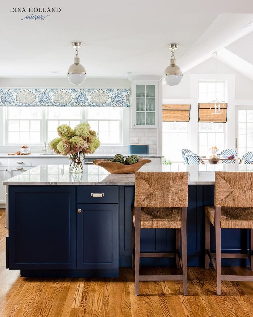
This deep blue color brings a dramatic effect to any space, making it a perfect choice for an accent wall in a dining room or living room.

As part of the latest paint color trends, SW Naval adds depth and richness to interior walls, working well with a range of color combinations, including warm browns and crisp whites.
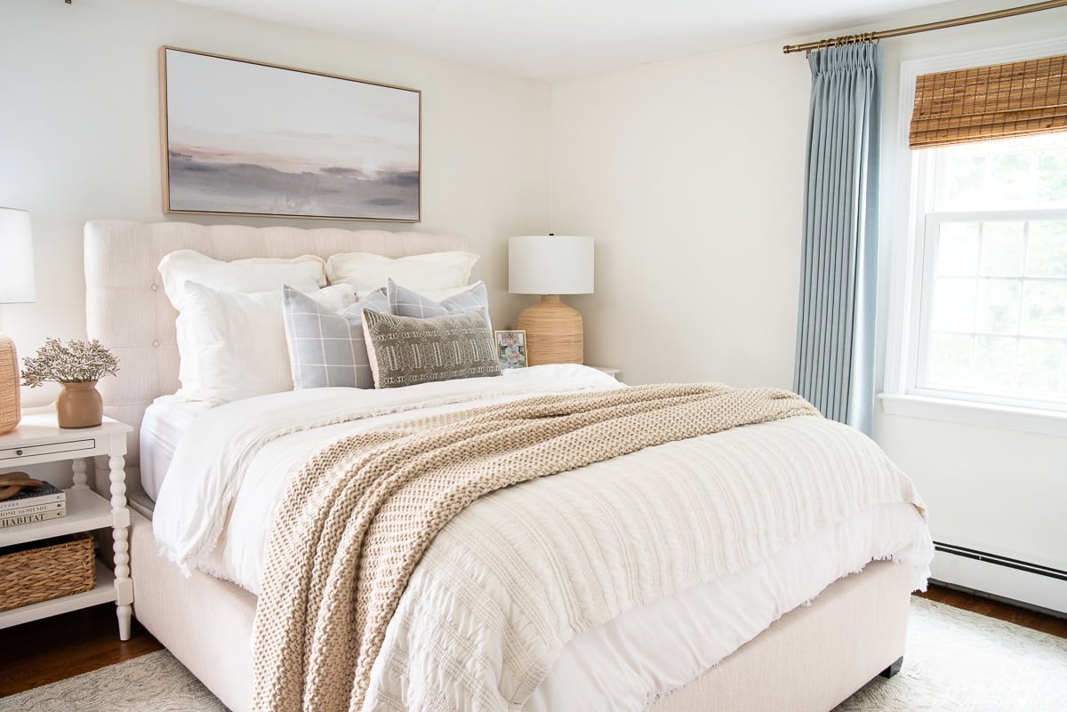
4. Benjamin Moore White Dove (OC-17)
BM White Dove is a soft white with a warm undertone, making it a great choice for creating a cozy yet modern look. It’s one of the most popular warm white paint colors for interior spaces, providing a gentle contrast against bold colors and wood stain colors.

This color is particularly effective in living rooms and bedrooms, where a sense of calm is desired.
5. Sherwin Williams Cavern Clay (SW-7701)
Embracing earth tones, SW Cavern Clay is a warm, terracotta color that brings a sense of warmth and groundedness to any room.

This rich color works beautifully in dining rooms or as an accent color in living spaces, complementing both modern and rustic elements.
As a classic yet modern color, BM Hale Navy offers a timeless appeal with a modern twist. This deep navy blue color is perfect for creating a focal point in a room, whether it’s on a gallery wall in the living room or as a bold statement on all four walls of a home office.

It pairs well with neutral paint colors and can make a big impact in both large and small spaces.
7. Sherwin Williams Accessible Beige (SW-7036)
Striking the perfect balance between beige and gray, SW Accessible Beige is a warm neutral that’s become a popular choice for modern homes.

This color is excellent for creating a serene and inviting atmosphere in any room, especially in spaces that receive plenty of natural light.
8. Benjamin Moore Palladian Blue (HC-144)
This soft, airy blue has green undertones, giving it a refreshing and tranquil feel. BM Palladian Blue is excellent choice for bathrooms or bedrooms, offering a sense of calm and relaxation. It’s also an unexpected choice for living rooms and dining rooms, but can look quite beautiful.

Palladian Blue works well with both warm and cool neutrals, making it a versatile addition to a modern color palette.
9. Sherwin Williams Tricorn Black (SW-6258)
For those looking to make a bold and sophisticated statement, SW Tricorn Black is an ideal choice.

It’s perfect for creating dramatic contrast as an accent wall or for painting interior doors. This black color pairs beautifully with warm neutrals and can also be used in smaller doses, like on a focal piece of furniture or frames.
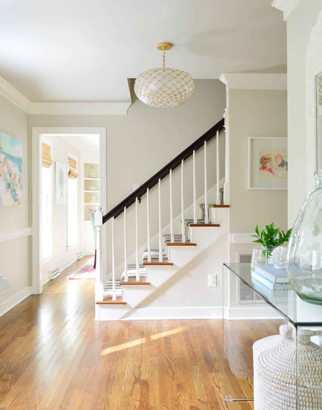
10. Benjamin Moore Revere Pewter (HC-172)
BM Revere Pewter is a gray paint with warm undertones, making it a great option for living spaces and master bedrooms.

Its ability to adapt to different shades and lighting conditions makes it a popular and versatile choice for modern interiors.
11. Benjamin Moore Backwoods (469)
Benjamin Moore’s Backwoods is a timeless, deep green paint color with mossy undertones, part of the Benjamin Moore Classics® collection.

This true green shade, without strong yellow or blue undertones, can appear cooler in certain lighting. Ideal for creating depth and coziness, it’s well-suited for accent walls and spaces like libraries or bedrooms.
It looks more vibrant in well-lit areas but can look more neutral in dim lighting. Backwoods pairs well with light warm neutrals, wood, and stone. It can be contrasted with earth tones or muted blush for a contemporary look.
Don’t Forget…
Don’t forget – no matter what you’ve read or photos you’ve seen online, it’s really important to sample paint colors in your home before committing!
Samplize provides real paint samples that are easy to move around your home, and cheaper than buying a gazillion paint pots! It’s the only way I buy paint samples.
Final Thoughts
Each color in this selection brings something special to the table for modern home interiors. You’ve got the laid-back vibe of Repose Gray, and then there’s the striking presence of Naval.
These colors fit a range of tastes and decor styles, making them versatile for different rooms in your house. When you pair them with the right furniture and decor, these colors really bring out that modern feel in your home, creating spaces that are both welcoming and on-trend.
It’s important to remember that the perfect paint color isn’t just about the color itself. It’s also about how it plays with the natural light in your room, the furniture you choose, and other elements. All these factors come together to shape the overall look and feel of your space.


Is it alright to use 24 x 48 tiles in a shower or should I use 12 x24?
Can you tell me what the flooring details are for the hallway pic (#10)? Thank you!
Hello, can you share what the coordinated trim, molding and ceiling colors are in #
10. Benjamin Moore Revere Pewter (HC-172)
We are building a home, so it is hard to really see the colors in all the different lights throughout a day in different rooms. Any recommendations for choosing colors?
I love all of your paint and color theory posts – Wendy
What color is on the walls with the 3. Sherwin Williams Naval (SW-6244). Love both colors. Thanks