BA-Thesis «Explorative Spatial Analysis»
 Nadine Prigann
visibility
…
description
136 pages
link
1 file
This work investigates the possibility of extending the linguistic notion «Explorative Data Analysis», aiming to experimentally investigate linguistic data in order to obtain useful information more exploratively, through a spatial installation using the example of birth reports. This prototypical attempt of translating data into the physical realm raises other questions and perceptional considerations that contribute to providing a more explorative access to the data. Furthermore, the process of data handling in combination with political implications due to material considerations is thematized.
Sign up for access to the world's latest research
checkGet notified about relevant papers
checkSave papers to use in your research
checkJoin the discussion with peers
checkTrack your impact
Figures (59)


Related papers
D. Smołucha, The World of Data. A few words about the visualization of information, "Perspektywy Kultury", 19, 4/2017
2017
In the world of digital technologies, the creation and reception of information are based on data processing, which is an ordered structure of data stored as a sequence of zeros and ones. This representation has significant consequences on how to collect, process, visualize and analy ze data. Currently, they are based mainly on algorithmic methods available from the application level, often generally open and free of charge. Data digitalizing is a challenge for researchers who, to practice digital humanities, should incorporate modern tools to improve their work with the massive amount of data available today. The aim of this article is describing the fundamental issues related to the exploration and visualization of data in the humanities. It is a contribution to the broader considerations.
Analysis-Finding Meanings in Complex Spatial Data Sets
2010
Spatial Data in Archaeology is a sub-project of a large research consortium, From Data to Knowledge (1996-2001) funded by the Academy of Finland, and lead by professor Heikki Mannila, from the Department of Computer Science, at the University of Helsinki. In 1996, the Academy drafted the Information Research Programme, the purpose of which is to generate a multi-faceted approach to information, its production, presentation, transfer, and utilisation.
On the Nature of Spatial Context
The topic of the present paper is spatial context, its complexity and multi-value. It is an attempt to incline to go beyond the location-oriented understanding of the basic notion, beyond the obvious and the perceptive features to the psychological or ideological spheres. Grasping the differentiated manifestations of the spatial context allows us to state that its form is impermanent and intangible. Hence the proposal to reflect the context through conventional features, which, according to the author, become the proper point of departure for every redefinition of the concepts resulting from the undertaken designing steps. Streszczenie. Tematem jest kontekst przestrzenny, jego złożoność i wielowartościowość. Jest to próba nakłonienia do wyjścia poza lokalizacyjne rozumienie pojęcia podstawowego, poza cechy oczywiste, dostrzegalne, do sfer takich, jak psychologiczna czy ideowa. Uchwycenie zróżnicowanych manifestacji kontekstu przestrzennego pozwala stwierdzić, że jego postać jest nietrwała, nieuchwytna. Stąd propozycja odzwierciedlenia kontekstu przez umowne własności, które w przekonaniu autora stanowią właściwy punkt wyjścia do każdorazowego redefiniowania pojęcia na potrzeby wynikające z podejmowanych kroków projektowych.
Dearq 27. Reglas visuales para un análisis socio-espacial: Infiriendo una gramática de uso en un Climat de France habitado * Visual rules for socio-spatial analysis: Inferring a grammar of use in an inhabited Climat de France
Climat de France, complejo de viviendas modernistas en Argel, fue construido durante los últimos años de la colonización francesa, en la década de 1950. A lo largo de los años, sus residentes han introducido algunas modificaciones al diseño original del arquitecto francés Fernand Pouillon, basados en el uso, los estilos de vida y los recursos locales. Utilizando documentación de archivo y fotográfica, vídeos y entrevistas para identificar, caracterizar y clasificar las modificaciones de las fachadas exteriores, este documento infiere reglas visuales como herramientas generativas y formales para analizar la continuidad y discontinuidad entre los actos socioculturales y las formas idealizadas en la personalización masiva de viviendas.
Translators of Data To Be Excluded: Aestheticization and Empiricization of the ‘Unrecognized’
Yetiskin, E. (2010). "Translators of Data To Be Excluded: Aestheticization and Empiricization of the ‘Unrecognized’, Amber Art and Technology Conference, Istanbul, 4-7 November 2010, 164-171. Retrieved from http://amberplatform.org/wp-content/uploads/2015/07/amber10_loRes.pdf.
Today the urban citizen is a passport number, a social security number, a color in the market research segment or a vote. The de-sire for political and economic mobility in the cities seems to be based on the intense labor of data for the sake of capital flow.The labor of data is amalgamated from scattered centers of generalization, categorization, calculation and identification where these can range from individuals to state and commercial institutions, corporations,research laboratories and modern art museums. These are also the translators of data to be processed. They distinguish the useful, the irrelevant and the redundant to be processed and transmitted as a functional basis for reasoning. The translators should be considered both as a mechanism and a method that produces factual information.And, they scrutinize data to control and/or elude governance in the urban context. But there seem to be more than this. Translation involves the power to control the production of data and accordingly translators adopt this power to decide whether which elements should be included or excluded.Therefore data incorporates a two-fold process that consists of exclusion: 1 (the irrelevant which cannot be considered as a fact to be processed to form data 2) the quality of data which can be considered as irrelevant to be excluded.
Spatial Behaviour and the Socio Spatial Recognition
Universitat Politècnica de Catalunya, 2017
Making Spatial Sense of Historical Social Data
Journal of Space Syntax Vol. 6(1), 2015
Analysing the relationship between urban form and society through time is key to understanding the patterns of socio-spatial phenomena observable in contemporary cities and the mechanisms through which such phenomena unfold. The engagement of space syntax research with historical comparative studies of urban form has opened up possibilities for studying the relationship between urban development and social phenomena through time. The theory and methods of space syntax have a positive contribution to make to this research agenda. They need, however, to be better integrated within a multifaceted research framework. While space syntax provides a reliable methodology to compare the city’s urban form at different points in time, the evolution of a city’s spatial structure is only one component of the processes which shape the city as a social entity. In recent years, relational theories such as Actor-Network Theory (ANT) and assemblage theory have highlighted the value of integrating different social science approaches in the analysis of social entities if we are to truly understand the complex processes which define the ways in which the social is realised in urban form. Although the implications of these theories in geography and urban studies have been widely explored, their relevance to space syntax research has received little attention. A meditation on their possible relationship informs the research presented in this paper. Drawing on key findings of an ongoing research project into the relation between social and spatial changes in the city of Nicosia through time (1883-2014), the argument advanced is that a critical reflection on the ways in which syntactical theory can engage with approaches from other disciplines is needed to inform methodological developments and facilitate the better interpretation of research findings in making spatial sense of historical social data.
Decontextualised Data and Socio-Spatial Differences
Springer eBooks, 2023
This chapter presents (personalised) data as commodities and demonstrates the related contexts of utilisation. Making concrete the possibilities of recursive reference in the data economy, we return to the physical environment: Using commercially traded data for the cities of Berlin, Munich and Essen, an exemplary and empirical study examines in what manner a data-based logic of utilisation reaches the different districts and their inhabitants and the implications this carries for socialisation and the overall social question.
Spatial Analysis in the Social Sciences and Humanities
Due to the Spatial Turn, research on space and spatiality has increased in all humanities and social sciences. Although there have been many theoretical debates and empirical studies within the above fields of research about the meaning and relevance of space, the debate is to this day surprisingly unintegrated as debates remain fixed within their respective fields. Interdisciplinary discussion is still the exception and so far has not resulted in a common cohesive analytical framework. Even more startling is that despite the long history and large quantity of empirical studies using space and spatial concepts as an analytical category, there is no systematic debate on methodology and methods of spatial analysis. This is even more surprising as there is a broad and thorough knowledge on many methodological problems concerning spatial analysis in various disciplines and subfields of these disciplines. This HSR Special Issue thus aims at starting a debate on integrating the methodolog...
Introduction
This example can be applied to the linguistic subfield of Corpus Linguistics, R01 as it provides enormous word collections and data sets, so-called corpora, from which long-term language usage can be examined very efficiently. Thus having to deal with this linguistic big data, there is a particular need of changing the perspective from a mere statistical point of view to visualizations, as it enables researchers to move in a different direction. Thus, they are able to gain another image, which they can assemble with the first one in a further step and conclude from it.
These visualizations are mostly exploratory graphics, which are used to plot data in order to search and analyze databases visually to find potentially useful information. From this information, concrete research questions and further proceedings can be derived, since these visualizations may reveal relevant correlations, which would not have been discovered if this method would have not been applied to the database.
Based on this information and referring to several visual analysts such as William Playfair, Edward Tufte, and Daniel Keim, it gets clear that transforming data from a mere statical and numeric table to a graphic representation improves processing, comprehension, and interpretation of statistical data immensely. This fact implies the necessity of the emerging field of Visual Analytics, which allows «the human to directly interact with it, to gain insight, to conclude, and to ultimately make better decisions.» R02
In his paper «Challenges in Visual Data Analysis,» R02 Keim also points out that «especially human factors (e.g., interaction, cognition, perception, collaboration, presentation, and dissemination) play a key role in the communication between human and computer, as well as in the decision-making process.» He furthermore explains that «in this context, production is defined as the creation of materials that summarize the results of an analytical effort, presentation as the packaging of those materials in a way that helps the audience understand the analytical results using terms that are meaningful to them, and dissemination as the process of sharing that information with the intended audience.» This statement points out that it is immensely important to have expertise in visual communications and interactive systems to translate and address these demands effectively. Furthermore, it is crucial to not only visualize data «through meaningful visualizations and clear representations» but rather take the audience and the viewer and their biases and backgrounds into account.
If we take these statements one step further and not only extend the representation from a table to a graphical 2d visualization and not only from a sheet to a book but additionally to a spatial installation, it could extend the perception from a mere 2d realm to a 3d realm through taking R01 Methodology of linguistics which is based on the actual use of language. Explained in detail in chapter 2.2.4 according to Bubenhofer, Noah; «Einführung in die Korpuslinguistik: Praktische Grundlagen und Werkzeuge» [2006][2007][2008][2009][2010][2011][2012][2013][2014][2015][2016][2017][2018]; Available from: http://www.bubenhofer.com/korpuslinguistik/. [Accessed: January 29, 2018]. R02 Keim, Daniel A., Mansmann, Florian, Schneidewind, Jörn, Ziegler, Hartmut; «Challenges in Visual Data Analysis» [2006] senses and interactive experience into account. Hence, the question arises if this spatial approach contributes an additional benefit regarding visual perception, and, evolving from that, if it is possible to enhance comprehension and experience of the linguistic data set on hand, especially regarding sequentiality, which is a major problem in Visual linguistics. R03 This is the starting point of my hypothesis, which aims to investigate the possibility of extending the notions of multidimensional data visualization and exploratory data analysis through a spatial installation in the physical realm. Additionally, it deals with scientific data and is experienceable through the spatial component.
Hence, the theoretical objective of this work is to introduce the notions of «Data visualization,» «Linguistics,» and «Epistemic interactions» as well as to investigate several forms of visualizations that are common in today's data visualization practice and question their usage in relation to the use for linguistic data. By taking into account these findings, weaknesses, and opportunities, visually speaking, for a spatial installation concept can be detected. This analysis serves not only as an attempt to improve the current visualizations concerning visual parameters but also as a first sketch of necessities and parameters to derive a spatial concept from. This concept may open another exploratory perspective on the data set.
My research established an essential starting point for this project, as it provided a necessary understanding in terms of visualization basics, its used methods, and its problems. Additionally, this research is backed up by a loose collaboration with Noah Bubenhofer from the Institute of Computer Linguistics at University of Zurich, Switzerland, who has not only contributed crucial linguistical background knowledge but also provided two data sets. One of these data sets deals with the analysis of 14.000 birth reports published in the web and the Corpus linguistic analysis of their language patterns. It is already visualized in a digital interactive way R04 and forms the basis for my installation.
In a next step, discussed in detail in the chapters 2.1.3, 2.2.6, and 2.3.1, I analyzed six visualizations and applications, not only in the field of linguistics, based on my research findings. Important key questions are for instance «Why was this form of visualization chosen?», «Is it appropriate for this data set?», «Could it be done in another way without losing but rather gaining extra information about the data?», «Could this visualization be appropriate for visualizing the data of the birth reports? Why? Why not?», «What is missing and how could it be implemented?» and «Is the visual language aligning with the numeric language of the data set?» Thus, I concluded strengths, weaknesses, necessities, and semiotic backgrounds of the visualization. This analysis is also extended and backed up with a perceptional questionnaire of the survey participants. General essential questions for this step are amongst others «How can I conduct this survey effectively for my project?» and «How can I get access to the viewers perceptional understanding?», since they crucially define the results. In this state, I exchanged with Benjamin Wiederkehr, who was a former bachelor student at ZHdK and has great expertise in a data visualization processes. He now runs his own agency «Interactive Things» in Zurich, focusing on data-driven digital products such as data visualization of complex topics.
Based on this research findings, I derived a spatial installation concept, which actively takes into account Bubenhofer's visualization of the birth reports both as a device to learn about the data and as a digital prototype to explore the data set graphically. To allow a detailed view onto this foundation of this visualization and my work, chapter 2 illustrates the emergence of this data set profoundly. The resulting concept for my work, displayed in Part B of this book, is featured from section 4.1 to 4.10. R03 Introduction to the notion of «Visual linguistics». This field of linguistics deals with visualizations in a linguistical context. The main objective is to explore data prototypically to be able to see connections and correlations. «Visual linguistics» [2006«Visual linguistics» [ -2018
Based on the theoretical introduction and the resulting thesis I profoundly illustrated in Part A, the following Part B will give an overview of the prototyping and concept process, which led to the final spatial installation, exhibited at the diploma exhibition at ZHdK in June 2018. The process documentation starts in chapter 4.1 with a survey I conducted with 29 people in order to define graphical essentials to derive a concept from and leads over to the first metaphor-driven prototypes in chapter 4.2 to conceptual discoveries in chapter 4.4, 4.6, and 4.8.
The final prototypical realization is described and shown in chapter 4.11 and 4.12 in detail. It consists of 419 acrylic glass tiles assembled to stacks of 5 tiles and hung in a strict grid which generates a parkour which serves as a chronological pathway for the visitor. This procedure displays the data structure as well as the utterances of the women and the 11 discovered clusters within these utterances, the so-called narrative patterns. Due to the material properties, these patterns are visible on the ground through projectors which illuminate the stacks. Additionally, the tiles also reflect the exposed light to the ceiling which indicates the reflective aspect of these utterances. Thus, a spatial extension of the notion «Explorative Data Analytics» is created, which contributes to the perception and understanding of a data set as it not only features another perspective on displaying that particular data set, but also raises questions about material usage in relation to the displayed data set and, resulting from that, further questions about the handling of big data and political effects of it.
R04
In chapter 4.12, I am introducing the result of this process, which is the realization of the installation, uniting theoretical as well as practical conclusions discussed in the chapters 2.4 and 4.12. This spatial outcome is nor a visualization tool, nor a data visualization per se. It is rather conceptually based on the data set on hand and, first and foremost, on interactive principles of knowledge transfer. Therefore, it manifests a tangible, experienceable installation in a physical realm, which is not only multivariate regarding sensual experiences but also in terms of representing the given variables of the data set. Thus, it works as an initial attempt to mediate between the complex topic of narrative patterns of birth reports and people of other disciplines.
Additionally, it firstly raises awareness about data handling and how this data set and data sets, in general, are created. Secondly, it raises questions about the relation of materials and data and furthermore, political implications of such a transformation process.
This enables the viewer to leave the boundaries of clearly formulated research questions behind and open it to, nevertheless within the given constraints, individual explorations and preferred ways of learning. Referring to German linguists, this approach may bring other unexpected connections, perspectives and perceptional conclusions with it. Thus, the notions of Explorative Data Analytics, Visual linguistics, and Visual analytics can be extended through this spatial component.
At that point, Lambert intensely contributed to the field, since he had mathematical skills and was able to depict data more generally and abstract with the mathematical means of coordinates. I06 This combination of Playfair's comparable approach of displaying data with Lambert's abstract way made it possible to conclude more efficiently from them. They make the viewer understand, that x is displayed in relation to y, x causes y or the other way around with empirical evidence. I07 This need to be able to understand the ongoing rise of complexity has been a continuing matter until today when we are no more talking about sheer mechanical systems, but rather digital systems, which are more complex and intransparent than ever, especially when it comes to massive data sets.
Concerns and problems
All those visualizations use different common metaphors and models to simplify complex processes. This is necessary to access and understand this given problem, but what is inherent in this way of processing data is the fact, that every visualization carries a specific expression in it due to the chosen model, for instance, network visualizations. This means that the visualization itself displays the information the way the chosen metaphor allows it to do. A word cloud, for instance, depicts other relations and facts of the word «mountain» than a network visualization would do. Referring to linguistics and according to Noah Bubenhofer, thus «a certain view on parlance is created.» It defines how researchers look at that data and which conclusions they derive from that. Hence, the way of visualizing data has a tremendous impact on current linguistical research.
A huge factor is, for instance, graphically distorted visualizations, as they are giving a false impression of the data set in many terms, such as of ratio, the comparative component, and the visual metaphors. The problem is well-addressed in the book «The Visual Display of Quantitive Information» by Edward E. Tufte, who raised key questions in the chapter of «Graphical Integrity» that play an important role here, such as «What is visual representation?» and «How do we know that it is correct what we see?» Another striking question of «Is the visual quantity depicting the numeric one?» is directly pointing at the visualization itself. User tests prove that a circle, for instance, differs in the perception of its area. Its visual size grows more slowly than the factual area. Different people see the same areas differently, and, additionally, perceptions change with experience, and perceptions are context-dependent.
Considered as a secure finding is the fact that a matter is strongly influenced by what has been perceived and learned before about this particular matter [Tufte, Edward R.; The Visual Display of Quantitive Information; p. 56]. This means that a matter that occurs simple and easily understandable for one person can be extremely abstract and difficult to understand for someone else if he does not have the same educational level.
These problems and principles, among many others, are strongly influenced by the field of Visual communications and thereby based on the experiences made in this field regarding legibility, spacing, color perception, and perceptional psychology. Thereby, they seem to be more of a basic and obvious matter but become even more relevant when embedded into bigger visualization systems. To make these problems more comprehensible, I am going to analyze two examples for every topic in the particular chapter; pointing out why the chosen examples are appropriate or why they are not, referring to linguistic data visualization.
In practice, a visualization of this exploratory type is a prototypical realization and a quick plot of these databases mostly plotted with common visualization forms, such as scatter plots and network visualizations, in multiple ways to reveal the connections inside the data set. This discrepancy of explorative visualization and these common forms bears a lot of subtle problems since these forms are generalized models, which may cut the content and may leave important details unrevealed due to the appliance of the model. When using these forms, the encoding of the visualized information is also altered through the viewer's cultural bias or his associations with the chosen form. Thus, the question of why these metaphors are applied and which alternatives could be used grew tremendously.
Furthermore, these data visualizations are frequently not taking into account visual parameters such as extensive labeling, providing context or taking care of legibility. This can falsify or at least make it harder to perceptually see the connections or define conclusions. An example of these problems in practice will be discussed in the subchapter «2.2.6.1 Scatter plot», where I am going to analyze the current visualization of the birth report data set R04 in detail. Referring to this particular data set, possible problems to improve in my work will be pointed out as well. R16
Related work and analysis 2.1.3.1 Stream graph
The first example of related work is the «Stream graph.» This form of visualization is highly appealing in terms of visual attractivity. It is elegant and fascinating and thus, the user is willing to work with it. But there are huge concerns about the legibility of labels and the comprehension of the matter itself.
I am going to explain these concerns with the example of the probably best-known example of this type of visualizations, «The Ebb and Flow of Movies: Box Office Receipts 1986 -2008» by Mathew Bloch, Lee Byron, Shan Carter, and Amanda Cox. It was published both, in a digital and in a print version in the New York Times on February 23, 2008. R07 The flow metaphor applies to many time-related topics and makes it easy to understand. One would assume that time flows from left to right, according to the western reading sequence, which is easy to embed and thus, creates a good entering point into the visualization. The amplitude of the shapes is also an excellent axis for mapping intensity or higher values onto it. The principle of «the higher the amplitude, the higher the values» is a principle, which is already known from physics and other «real-world-analogies,» using metaphors from the physical world around us, and thus, equips almost every viewer with a basic understanding of this mapping method. Additionally, the analyst can color these shapes according to their amplitude values, which amplifies the communication of these values. This should only be used in hardly understandable graphics, as, according to Tufte, the analyst would use two graphical dimensions for one numeric dimension, which is not necessary in most cases. The color coding should, in these cases, rather be used for distinguishing these shapes in terms of attributes or categories, taking into account that color spaces are not a natural order criterion, which makes it hard to communicate the information effectively to every viewer and on a collective basis. When using these encodings, the analyst should either use clear complementary contrasts, which are conventionally learned by the general viewer (e.g. red for high values, danger, call for action and green for low values, no need to act, no danger) R08 or do intense user testing with the target group to find out their individual color code understanding. Nevertheless, regardless of the user group, the coding has to be specified and explained in an explanation aside or beneath the visualization to provide a context and ensure that the user is interpreting the graphics correctly.
What strikes the viewers mind is the slightly disturbing display of these different shapes. It is not clear if they are overlapping or just closely placed. Furthermore, the shapes are too different to compare them, which renders the ability of a precise analysis obsolete. Color coding can ease this problem a little bit, but it seems that it is necessary to make this visualization understandable. For reasons mentioned above, this is not a recommended proceeding. Another powerful counter-argument is the smooth curves. They are likely to be interpolated for beauty's sake and thus, are simply incorrect. The result is a visualization, which is beautiful in visual terms and invites the user, at first sight, to work with it but ends up having two variables, the shapes and the color coding, whose statements are not clearly comprehensible and thus, may not meet the requirements of visual knowledge transfer.
Furthermore, the labeling is inconsistent in most cases as the different font sizes are not representing an actual numeric value of the data set but rather referring to the available physical space within the shape itself. Additionally, it is displayed for those shapes, which are large R07 Bloch,Mathew,Byron,Lee,Carter,Shan,Cox, R08 The semiotic notion «icon» is a sign, which is a perception that refers to something or awakens the idea of something that is not the sign itself. This means an icon is a type of sign similar to the thing it refers to. «Index» is a sign physically connected to its object and «symbol» is a conventionalized sign for something. Friedrich
R07
enough to contain it and left out in small areas. This may work or at least be tolerable in digital visualizations but is unbearable in print versions of these visualizations because the general understanding and opportunity to grasp the overall meaning at one glance is not possible. A concrete example is the print version of the visualization mentioned above. In this case, it is evident that the metaphors chosen are not suitable for this type of data set, as they need a detailed further explanation on how to read and perceive it. This information is, reversely, again disturbing the quality of legibility and intuitive perception. Instead, this space could be used as space for the explanations of color codings, units, etc.
It can also be seen critically that the NYT printed the visualization turned 90 degrees clockwise, which works fine at first glance but confuses the viewer if he is familiar with the digital version. R09 To summarize and transfer this analysis to the field of Visual linguistics, the central issues of this visualization form are the lack of legibility and the massive amount of the disturbing graphical variables in them, which have a high potential of misleading the viewer and have them misinterpreting the data set. This fact makes it unusable for linguistic data analysis, as labeling, the possibility of a precise depiction of values in terms of time-based positioning and frequency are key concerns for the data set on hand. These issues confirm the claim of many visual analysts to crucially rethink and redesign this type of «art with information design approaches,» as put by Gert Neilsen, an author of VisualJournalism. R10
Data maps
Data maps are maps of a specific area, which deal with the spatial representation of a specific data set. These maps are somewhat useful to visualize data and its relations between it in a direct spatial context, for instance, numbers of a population within a specific area. Because of dealing with a specific topic, these maps are also called thematic maps. Since these depictions of continents and countries are very easy to understand by the viewer, it is easy for them to relate immediately to the spatial component. This fact reduces the effort of the viewer to decode the visualization enormously and leaves more capacity for a profound and elaborate data representation. Thus, more information can be conveyed. With the means of color coding, it is easy to distinguish different areas on these maps and visualize different data sets.
This fact leads to the central negative aspect that visualizers should be aware of. Since color coding is, as mentioned in the previous chapter «2.3.1 Stream graphs», not a very precise method to communicate concrete values, it also creates the visual impression that the data stops at boundaries, landmarks, and borders.
Furthermore, especially shaded-in-area maps bear the problem that viewers tend to generalize the displayed data. It seems that the visualization affects the whole population, nature, or economy in this area and in others not. This is a fatal assumption since it does not allow the opportunity of showing real data diversity, which in a further step leads to misinterpretation and eventually, making wrong decisions when not aware of the generalization such visualization method bears within.
Another inherent fact of maps is the aspect of representing a specific view of the world, which is not an essential problem of the visualization itself but rather a problem of data perception and communicating values and convictions between the lines. Most world maps created in Europe, for instance, are visualized with a light to an extreme shift of the equator towards the south to have more space for displaying data in the northern area. This creates the impression that these areas are more important to the visualizer or the world itself than the countries in the southern hemisphere, which are mostly third world continents such as Africa or South America. R09 The consequences are not only a post-colonialistic view of the world, which has to be seen very critically but also an extreme distortion of the world as a general depictive model. This can be avoided through a simple supply of different possibilities of viewing the world, not only the usual Eurocentric, US-centered, or Chinese centered view.
Examples are the method of Lawrence Fahey that depicts a pseudocylindrical, neither conformal or equal-area of the world or, probably suitable best for visualization purposes, the Hammer projection, which produces an equal area map of the entire globe. Astronomers use this projection to show the entire celestial sphere on one map in a way that accurately depicts the relative distribution of the stars in different regions of the sky. R11
One visualization which is a good example both in terms of visualizing data and the different projection modes is the visualization of geo collocations by Noah Bubenhofer. R12 This interactive and web-based application shows specific words and its collocators R13 based on their spatial location. It thus allows inferences which connotations of which words are used where. Search parameters can be adjusted within the panel on the left. Here the viewer can also find the different world projection modes and, additionally, different ways of depiction the data itself, which ranges from a map to a circle display or even a completely abstract way. Switching from the map view to the circle view is animated, which helps the viewer to follow and reenact the transforming and relocating depictions. This is a very comprehensive approach to leave data exploring and displaying up to the viewer. That proceeding not only clarifies how the projections are to be understood but also maximizes the experience level in a digital visualization. This leads to a better understanding and knowledge transfer of the data set.
Linguistics 2.2.1 Historical overview
The main ideas of linguistics of the 20th century were strongly influenced and defined by Swiss linguist and semiotician Ferdinand de Saussure. He established the understanding of a dichotomous language concept, which says that a distinction must be made between a purely formal concept (langue) and the actual spoken language (parole). In concrete terms, this means that langue is the conventionalized concept in the minds of the speakers, whereas parole is the language that is currently spoken and also changed according to the situation.
De Saussure was not the first who came up with this two-sided definition. Also Hermann Paul previously spoke of two sides of the language. «Use meaning» (langue) of words means the meaning that they have in themselves and «occasional meaning» (parole) means the actual and momentary form of the language. Additionally, changes in parole can also manifest in the long run in the langue, which can explain language change.
These early and crucial linguistic approaches were further developed by Noam Chomsky, who is not only known for his linguistic theories but also for his critics of US politics. He extends the dichotomous language concept to his approach of generative grammar, in which he established the thesis that it should refer not only to individual words but the complete use from a biological point of view. He distinguishes «competence» and «performance,» whereby competence is the native language, the acquired ability to understand the concept of language. The biological aspect is provided by the fact that certain linguistic parameters are innate and are gradually specified with the development of the child. Competence thus forms the ideal language concept that can be used to fully develop language development. «Performance,» on the other hand, is the actual utterance that is subject to errors in the situational context. Although this is similar to the concept of parole of De Saussure, however, «langue» and «competence» differ because «langue» is understood as a fixed rule, whereas «competence» instead means the modular use of existing rules. In 1965, Chomsky modified his theory, because «performance» is not suitable for studying biological linguistic patterns due to errors. He now defines «i-language,» which is the language mainly mental (internal language) and the «e-language» (external language) as actually spoken language, which can be anything that is not «i-language,» so for example, conventions to which the community of speakers has agreed (dialects). They are now part of the «e-language» and no longer «langue» as in the model of De Saussure.
There have been fewer attempts to open up this two-sided dichotomous language concept, but one approach is Corpus linguistics.
Corpus linguistics
Corpus linguistics is a methodology of linguistics, which had its breakthrough at the beginning of the 1960's. It is mainly characterized by the use of authentic language data, which are documented in large corpora. Such text corpora are collections of linguistic utterances that are put together according to specific criteria and with a specific research objective. The findings of Corpus linguistics are thus based on natural expressions of a language as it is actually used. This use of language is the main factor of this methodology and, based on this, structural rules of the language can be derived, which are not manifested before use, as in the theories of De Saussure, Herrmann, and Chomsky. Hereby, different patterns of use and parlance can be ascertained and can disclose, for instance, in which political circumstances which words were used. From this standpoint, a socio-cultural and political image of the language can be created, which represents the language in its complexity more suitably than a mere dichotomous approach. R01
Optical Character Recognition (OCR)
The utterances, on which the corpora are based, can either have been written or may be spontaneous or elicited spoken language. In order to take every known source of statements into account and thus, be able to understand the complexity of human language with all its social, cultural and political aspects, it has become a mere necessity to digitalize and transcribe information such as books or audio files. This is mainly happening with the help of the technique of Optical Character Recognition (OCR). R14 Documents are scanned and every word is transferred into an item in a digital file, such as XML or CSV, and tagged with attributes, such as spatial information or date and year. Thus, these files can be used for linguistic research using specific software. R15
This necessary method of digitalization creates enormous data sets, which face the researchers with new challenges outside their subject area concerning dealing with big data, structuring and categorizing it, to enable themselves to set up a stable and broad basis for this type of research. This foundation has to be processed in order to be able to understand it and find patterns which help to derive further proceedings.
Exploratory Data Analytics (EDA)
Since questions can only be formulated when knowing the data set or knowing what to look for, which is not always possible, exploratory data analysis can be used. Questions imply that we know what we are looking for, we know, what the data set is going to tell us, what we are going to have visualized. We know that the data set can answer this question.
But what is inherent with having the questions prepared before looking at the data is the fact, that we tend to only look for the answers to these questions, rather than for details and unexpected connections, which could be revealed or lead to other interpretations. In other words, we just miss that there is more in that data set and by asking concrete questions, we cut and frame the possibilities of a unique data set down to something standardized.
Thereby it seems obvious, that there must be a step before formulating these questions. As John Tukey defined it, «there must be an acquaintance with the data beforehand in order to get to know the data set, to understand its figures and to see its connections.» Furthermore, Edward R. Tufte points out in the video «The Art of Data Visualization» by PBS Studios (Min 6.57) R16 , rather than knowing the questions and answers, «we should really know the content and reason about it because we want to see to learn something not to confirm something.»
The most common method to achieve this «seeing» is visualizing this data with graphs and diagrams. Since presentation graphics R17 are used merely to depict results and data, which are already known, exploratory graphics can be applied here in order to discover patterns and structures and thus, gain new approaches of how to continue, R18 as they transfer the data set from a mere numeric display of information to a visually extended version. Mostly, this procedure provides insights and conclusions, which would not be taken into account when not applying this method.
Related work and analysis 2.2.6.1 Scatter plot
A scatter plot is a type of plot or mathematical diagram using Cartesian coordinates to display values for typically two variables for a set of data. Through their way of construction, they serve the primary purpose of showing how much one variable is affected by another and thus, explores their relationship, also called correlation, in an exact manner. The advantage of this method is the precise depiction of the values and the variety of representable variables is limited to a maximum of five (one for x, one for y, one for color coding, one for size of the point, and a fifth one can be added through a z-axis, when visualizing in a 3-dimensional way). R19 This could also be a disadvantage, but since there are few visualization forms, which can deal with more than these five variables in a precise way, this method can still be considered as one of the best methods for visualizing substantial data sets. Nevertheless, the visualizer should be aware of the fact, that the viewer assumes a direct connection between all the visualized items. Additionally, it can get very unclear when dealing with massive data sets and extensive labeling.
Given the fact that I am dealing with this data set in my practical work, I am going to quote the example of Noah Bubenhofers visualization of 14.000 birth reports. R04 R20 He already visualized this data through a 3D scatterplot, but not actively taking into account visual points of view. He was rather focusing on a practical visualization, which could carry the top 481 data points in one visualization, and additionally, be able to work with three variables (x-axis for position in birth report, y-axis for the frequency in the report, and z-axis for displaying the similarity of these parts of the report), which led him to a 3D-approach. During an interview about this visualization, he said «that it was a major criterion to display not only all of the data points to correctly show the time-based progress of these birth reports but also their correct example labels and integrating a quick info when hovering over a data point, which provides a more detailed insight into the data set.» Since labeling and quick tips are crucial for linguistic visualizations, this consequence in displaying the data set correctly with all information leads to the problem of legibility of this visualization. The major problem, which arises from that and as also pointed out by Noah Bubenhofer, is first and foremost the question of how time-based and sequential linguistic data can be displayed in a more comprehensible or even in a challenging way. The choice of using a scatterplot does not seem to be the cause for the problem (although this choice should be questioned critically, of course) since it is nearly the only method which allows displaying a data set with this complexity. It is rather the complexity of the data set itself, and it seems that visual editing can contribute a lot to solving these problems. Through analyzing and user tests the issues can be found and the display of this information could be improved, especially regarding legibility, and thus, provide the basis for a visually improved approach of this visualization. What is still a problem is the scale of the visualization to firstly, enable to see an overview and secondly, have the labels still readable. This calls for a more extensive scale to cover these concerns and additionally, point out the time relation.
Network visualization
The linguistic corpus «Text+Berg-Korpus» R21 contains all reports and articles of the yearbooks of the Swiss Alpine Club from 1864 until today. The visualization for this project «Text+Berg-Korpus,» also by Noah Bubenhofer in 2013, visualizes all of these words and their typical relations to each other within this corpus. Additionally, they are categorized with color coding. The visualization is accessible online through a zoomable SVG. R22
To begin the analysis, I want to briefly put the focus on the use of the network visualization form. This model implies that all the displayed items are of the same size or quantity and thus, are somehow connected. The spatial white realm between the elements is mostly referred to as a spatial or semantical indication for the relationship to each other. The closer, the more related.
Since there is no labeling or explanation in this particular case, it is not clear whether this is intended or not. These missing labels are also what immediately strikes the viewer's mind when entering this visualization. Only the title and the authors are visible when zoomed out, but apart from that, there are no indications which give orientation regarding the number of words or what the spatial position of the words mean. Furthermore, the color coding is not communicated. One could assume that it could mean semantic relation of the words or a time-based relationship, but these are just assumptions. According to Tufte, labeling and providing content is one of the fundamental necessities of a visualization. This helps the viewer immensely to decode the information and explore the graphic, which is not possible in this case. What should be taken into account is the fact, that this visualization is a research prototype of the project and thereby serves people who know the displayed data in detail, but still these basic labelings and explanations of the codings should be indicated to avoid confusion or misinterpretation through mixing up colors, for instance. This could happen easily and in consequence, crucially alter the research conclusions. The fact that this visualization is available publicly enhances and underlines these statements.
Another point, which is crucial in my opinion is the interactivity. When entering the visualization, the viewer starts off with a zoomed-in position somewhere in the visualization. There is no indication where the starting point of the visual story of this visualization is, nor a hint of which interactions are possible. For instance, a note that dragging is possible and reveals other parts of the visualization, or that zooming out gives an overview of the whole scope of the data. This is also interfering with one of the main principles in the field of data visualization, amongst others pointed out by Edward Tufte and Ben Shneiderman, that a visualization should deliver «Overview first, zoom and filter, then details-on-demand.» (Shneiderman, 1996). R23
Legibility is a task hard to handle in this case, since it is a massive database and the labeling of the nodes is particularly and inevitably necessary, because of dealing with linguistic data. The crowded appearance can also be seen as an invitation to zoom in, try out and explore the visualization, but to communicate this, interaction instructions should be provided. Another possibility could be working with distinct metaphors, but these are hard to communicate without labeling and thus, pointing out a topic the viewer can refer to. We should not underestimate the effort the viewer has to make to decode and understand the topic but rather do our best to support him with this act. Therefore clear labeling and interaction basics should be provided. This topic will be discussed more in detail in the following chapter.
Epistemic interactions
Starting in the 1970's, cognitive studies are the basis of modern interaction design, as those studies define fundamental key concepts in terms of the connection between perception, interaction, and knowledge transfer. According to Karl Faust who is the Director of Information Architecture at the Toronto-based software design studio Normative, perception is input, followed by the act of perceiving, identifying and processing this information and in the end, the result of a successful process of this information, action as an output follows.
Although the human brain has an immense capacity and ability to perceive and catch complex visual information within milliseconds, it needs perception to process information efficiently and in a short amount of time.
The paper «On Distinguishing Epistemic from Pragmatic Action» by David Kirsh and Paul Maglio R24 points out, that «performance is demonstrably worse if agents rely on their private memory or on their own computational abilities without the help of external supports.» It therefore defines the notion of epistemic actions and states that these actions «make mental computing easier, faster, or more reliable» and that these actions are «external actions that agents perform to change its own computational state» On Distinguishing Epistemic from Pragmatic Action;1994: 3]. This paper thus points out, that more experienced players of the game are more affirmative to interactions and rather turn the piece and try within the remaining time than to reason about these possibilities in their head. This is due to the fact that checking the possibilities in your head that one piece has to fit in a specific gap takes 500 milliseconds, but checking out the possibilities physically takes 100 milliseconds.
Furthermore, «a player, who moves a piece from the left of the screen then reverses it back to its original position, performs a series of actions that leave the physical state of the game unchanged», but rather «alter the player's informal state» [Kirsh, David, Maglio To supplement Kirsh's and Maglio's point, Faust described it in his talk at the World Information Architecture Day 2018 in Zurich, Switzerland on February 24, «every interaction is an improvement of perception» and essentially influences the process of thinking, since «thinking means working it out through interaction in the physical world.» He points out that the reliability of decisions is drastically improved when interactions play a role within the thinking and decision process, because «arranging facts, models and thoughts in your head is inefficient and tends to mistakes.» This statement is based on a testing with several people who were asked to count and add up coins depicted in a picture. Since they could only count and calculate in their heads, without the coins itself, they needed 22.5 seconds and made 20.3 mistakes in average, whereas using the hands to count the physical coins on the table led to a fast er and more reliable result within 18.7 seconds and only 12.6 mistakes in average. I07 Even simple interaction can help to «think» faster, Fast concludes this study.
Referring to the topic of Interaction Design, this means adding epistemic actions to be interactions, such as rearranging (altering the spatial position and / or the orientation of a representation, or the components within it) or chunking (grouping independent, but related, visual elements into a unified visual structure), R25 improves the learning and understanding process crucially, as these actions support the thinking process in a way that is related to the actual physical action and to the notion of «prototyping,» used for a hands-on-based thinking and developing in the field of Interaction Design.
Applying these statements not only to the methods introduced by Fast but rather taking these statements one step further to the more complex matter of sensual subconscious interactions such as touch, feel and hear, this set of interactions could help to transfer knowledge better. Additionally and in a broader sense, the use of metaphors and any method which eases visual encoding of information can also be referred to. According to George Lakoff and Mark Johnsen, this works best if the metaphor correlates with the physical phenomenon it wants to describe [Lakoff, George, Johnsen, Mark; Metaphors we live by; p. 18] and if it bears some kind of reference to the culture it is used in [Lakoff, George, Johnsen, Mark; Metaphors we live by; p. 21]. R26 As an example, direct manipulating R27 as an interaction concept in the field of Interaction Design is a crucial concept, which can be transferred to almost any kind of surroundings where the barrier of getting into the matter should be eased.
Related work and analysis 2.3.1.1 Zillow
The first example for enhanced access and an improved exploring aspect is the website «zillow. com,» R28 which embodies and unites significant amounts of epistemic interactions, such as filtering, cutting, searching and repicturing so the user can determine his area of interest he wants to search in with the help of the custom region tool. Several filtering options are available to refine the result. This example shows how subtle epistemic interactions can crucially influence the experience users have when using a service and show very detailed, how subtle these interactions use metaphors of the analog world R29 to enhance perception and understanding. This subtleness and implicitness are one of the key properties my final project intends to have.
Dust & Magnet
The second example is «Dust & Magnet,» a data exploration tool for multivariate variables, which plays with the metaphor of dust as data and magnet as the filter to narrow down the search result. R30 This work shows how users can use the metaphors of metal dust and magnets, which in this case works as an epistemic interaction, in an intuitive way to exploratively investigate the data set.
R30
Furthermore, it is a good example for the physical correlation a metaphor needs in order to work, as Lakoff and Johnsen pointed out. The intuition and thus, the given understanding of the provided interactions is the crucial and interesting element of this project.
Further projects
This chapter deals with a wide range of works, which are related to my project either because of their realization, their topic or their principles of knowledge transfer. Every mentioned project embodies an interesting approach, which is worth considering for the practical work.
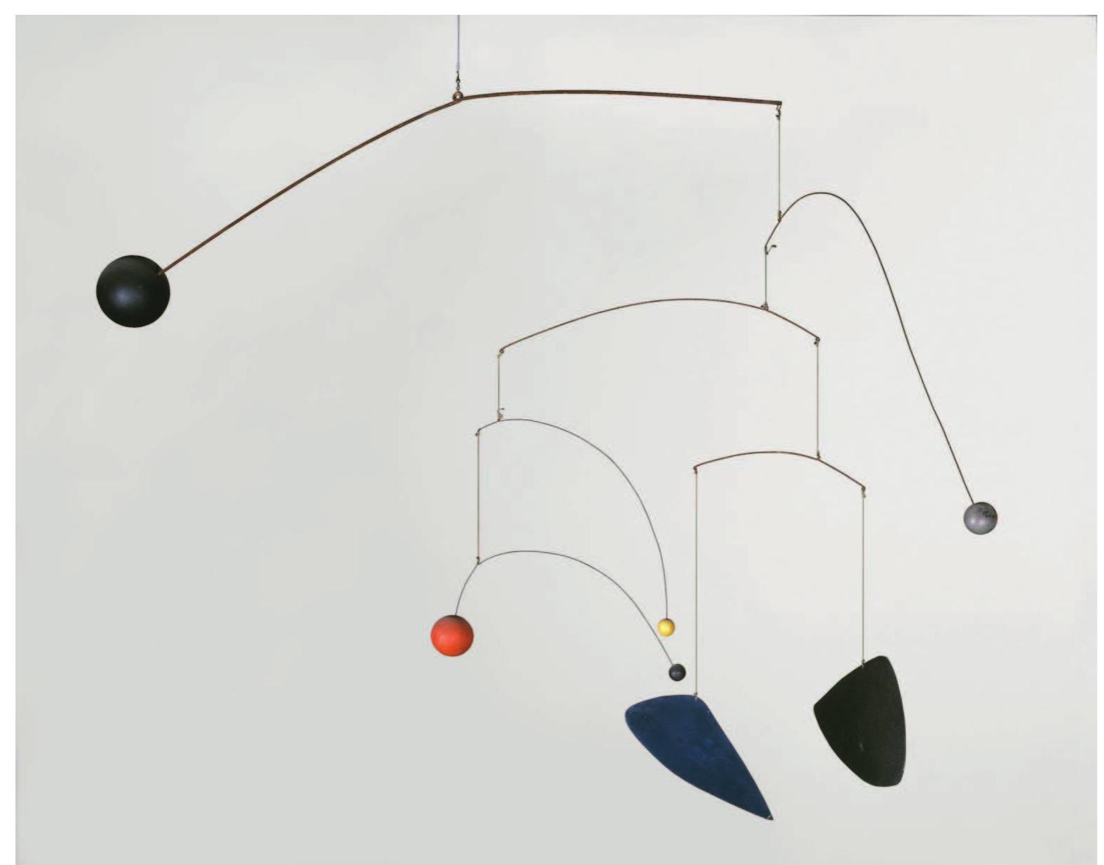
Generally, a lot has been done in the field of digital visualizations, also and especially in the business context. Agencies dealing with data visualization in a broader sense are the Zurich-based Interactive Things, Onformative, and Waltz Binaire, just to mention a few, but also installative approaches have been realized, which in most cases strongly refer to the field of kinetic art in terms of form, size, and realization. This art form depends on motion, time, and the participation of the viewer for its effects. R31 Major contributors to this field are the originator of the mobile, Alexander Calder R32 and the Swiss painter and sculptor Jean Tinguely. R33
Referring to kinetic art, other interesting installative works are for example «Symphonie Cinétique -The poetry of motion» R34 by art+com, a Berlin-based agency, which creates interactive installations and medial realms. This project is a series of highly sophisticated installations which deal with the topic of reflections in a very intelligent way and take the surroundings into account. Installed at MADE Berlin, the musician Ólafur Arnalds composed a piece for every installation itself and performed it live at MADE. Thus, this composition was made for this special occasion and realm and explains the possibility of interpreting data in another way. It is also a good example, how the factor of time can be actively embedded in this performative setting. What has to be stated is that art+com is not working with data-driven installations, and additionally, the interactive and thus, explorative part is missing, which will be crucial for my work.
Another project which functions as an example of a time-based installation in a very experimental but efficient way is the project «À la recherche,» also by art+com. This location-based kinetic installation, reminiscent of an exploded disco ball, reflects the light in such a way that points of light scattered on the walls appear and from these, repeatedly, the words «RE TROUVE LE TEMPS PERDU» are visible. These words can be understood as «The lost time found» (LE TEMPS PERDU RETROUVE) or «Search the lost time» (RETROUVE LE TEMPS PERDU), depending on where they begin to read. The installation thus refers to the legendary past of the place Les Bains in Paris, where it is installed. R35
This work is a good example in terms of providing content, referring to a data set, or a matter of research and representing it in another perspective, which enables the viewer to explore things and new combinations. This aspect is referring to the term «Explorative Data Analytics» [chapter 2.2.4] in some aspects, and thus, transferring it to spatial installations in a very experimental and therefore inspiring way. The installation visualizes different words, which are shown in a fixed R31
R35
amount of time. While observing the installation, the viewer gets to know the whole story step by step. Through this time-based set-up and the way of dealing with this sequentiality, it imputes a storytelling aspect to the work. Additionally, it also contains the aspect of reflection in various ways. Firstly, the installation is reflecting on the matter and the history of the location itself, expressing the findings of this reflection onto the wall and secondly, using a metaphor for enhancing the expression of the message. This is a first approach to a kinetic and time-based showing of sequentiality and most likely the best role model I found so far for the spatial installation in terms of approaching and visualizing the topic and additionally, taking the viewer into account. What I had to be aware of, referring to the complexity of my data set, is the possibility of orientation within the content of the installation and exploring it manually, as well as to put the focus on the communication of the linguistic research topics, such as narrative patterns.
In general, it is useful to have a closer look at the projects of art+com, since they provide useful and crucial information about how to cover the parts of translation of data into a spatial installation without removing a necessary amount of challenging decoding when using metaphors, realization with a kinetic approach, and referring to the location it is installed in.
All the works mentioned above are particularly interesting for me because of their embodiment into the realm and the way they deal with time-based topics. Most of them use the spatial realm (distance) as a metaphor for time. This metaphor is very common and easy to understand, as movement and exploration of this realm are strongly and also physically associated with time. R26 Additionally, they mostly leave it up to the viewer's pace to explore and learn the topic, which is crucial according to Kirsh and Maglio, and Fast, especially for learning surroundings. These facts ease en-and decoding of a complex data set and thus, make it an appropriate strategy to communicate the linguistic data set on hand.
As a direct example of a spatial data visualization, I would like to mention the work of Natalie Miebach who «translates science data into sculpture, installation and musical scores.» For her project series «Changing Weathers,» for instance, she «began building low-tech data-collecting devices that extract weather data from specific environments. Living on Cape Cod at the time, she went to Herring Cove Beach for 18 months on a daily basis, rain or shine, to observe and record the relation between weather and environment. The data was then compared to historical and global trends in weather and finally translated into a series of sculptures.» R36 Referring to my hypothesis, this project is a very good example how translating data into another visual sphere can create a new understanding of the data set. This leads to the possibility of gathering new kinds of information. Since she was also collecting data over a certain amount of time, it is also a good example of how the aspect of time defines the look of the object. In a linguistic context, such installations can visualize sounds of someone pronouncing a word or telling a story. In terms of relation to time, it could be possible to have the viewer assembling this piece in order to let him reenact the gathering of data and thus, lead to a better understanding.
Dynamicland R37 provides another approach on how to display complex systems or processes. It is a humane communal computer with real people, who work together and thus, visualize the processes that happen inside a computer and would be very hard to understand if not visualized with this hands-on approach. Since there are several approaches of live-performing a linguistic phenomenon, such as pronunciation, it is a considerable way to visualize data with human involvement. This is a very hands-on approach to reenactment.
Theoretical conclusion
In the previous pages, I gave an overview of linguistics, data visualization, and epistemic interactions. I pointed out what the properties of these visualizations are and in which cases they are used mostly. I also analyzed two examples of data visualizations in general and two examples of specific linguistic visualizations in order to find aspects which are crucial for visualizations and may be applied to the current visualization of the birth reports in order to improve the knowledge transfer. In a further step, these necessary parameters may be integrated into the spatial concept.
Concluding these analyses, a fact that strikes me is that the Stream graph example and parts of the Data maps as well show a lack of basic visual concepts when it comes to labeling, legibility or fundamental visual perception theories such as color coding. These parameters are neither easing entering the topic nor challenging the user in order to enable him to learn while exploring. Thereby they are not contributing to an ease of communication of the data, as they leave him without a clue how to interact with these visualizations. They leave him with an unprecise description of the data and often crucial context and explanation is missing. These weaknesses have to be edited, considering these basic visual guidelines, in order to transform the visualization into one that is easily accessible and carries a learning potential.
The linguistic visualizations are dealing with the same problems, but in their case, they are mainly exploratory graphics used for quick plotting and visual examination of the data. This purpose embodies unfinished and rough-and-ready parts in order to be generated quickly and therefore, most of these graphics do not meet the requirements of effective design practice, for instance, defined and discussed by Edward Tufte, John Tukey, and many others.
But since researchers conclude from these visualizations, they would benefit from more advanced visualizations taking into account visual guidelines such as legibility, consistent labeling, and knowledge in the field of perceptional theories. Furthermore, a vast amount of these visualizations has been published and are available for a greater audience. This fact emphasizes the necessity of resorting to these visual principles, as this audience is not able to decode these visualizations without an ease or the creation of an entry point through these principles or the use of epistemic interactions.
Generally, I have been pointing out these weaknesses and the necessity to improve this display of data in order to enhance the conclusion process from this visualization process and, additionally, to extract crucial and necessary principles of digital or print visualizations, but I will not go deeper into this topic. For my objective, it is far more interesting to work with the visualization of 14.000 birth reports by Noah Bubenhofer in the same way he does: as a prototypical plot of the data to first and foremost understand what the data is about and how it looks like in this particular depiction. This visual explanation will help me to conclude and to see correlations. Embedding these research results and principles, extended by the principles of epistemic interactions, into my further proceeding, will enable me to gain an understanding how a time-based spatial depiction of this linguistic data can be approached.
Creating such a spatial installation not only contributes to the mediation of research results but also covers a gap in the presentation of these results. It can be observed that particularly in the field of linguistics, which everybody is concerned of since we all speak and communicate, knowledge transfer of research results on a spatial and experimental base are not common. In contrast, in natural sciences, people can get in touch with the topics on so-called «Science Days,» where researchers present their intermediate results in the form of an experimental setup or live demonstrations of a phenomenon. This possibility demonstrably improves the understanding of the topic. This procedure can be transferred to the field of linguistics and particularly on the data set on hand.
In the very specific case of this data set, visualized as a Scatter plot depicting the typical use of language and the narrative patterns of mothers giving birth to their babies, the main problem is, amongst the previously mentioned general annotations, displaying the time-based factor with the examples of the stories, which is the essential variable in this visualization.
Especially in this case, a spatial installation could lead to a better knowledge transfer, since it provides a broader range of variables that can be accessed, partly very subtle and thus, with almost no effort of decoding. For this act of transferring, the use of appropriate interactivity, be it subtle or with the help of concrete translations or metaphors and not just digitally spoken, could help the viewer to reenact with the topic much better than a complex visualization with variables that require expert knowledge to discover their real meaning. There have been many nodes where statements of the quoted specialists prove this statement elaborately and give an example how this fact could enhance the process of knowledge transfer. Examples are for instance the use of epistemic interactions, as well as addressing the senses such as hearing and smell.
Referring to the topic of epistemic interactions and especially to the Tetris example of Kirsh and Maglio, this knowledge can also be used to intentionally foster an active examination of the topic in a challenging way. This can, when embedded and set up properly with interaction instructions and crucial hints how to approach this installation, lead to an active learning process by «thinking when doing» as Fast pointed out. Practically speaking, this means to find the right balance between providing information and leaving the discovery up to the viewer.
To come back to the book on your desk, this spatial approach could enable viewers to change their position into several directions in order to gain multiple images. They could touch the material and thus, learn that it is made out of paper or tell from the sound it makes when opening it or flip a page. By layering all those perceptional images, they can not only tell that it is a book but obtain more profound information, such as which thickness or feel the paper has, how it smells, and how heavy it is. Due to that, a more profound and complex understanding of the subject «book» can be fostered.
Practically, the installation could be a kinetic installation with several balls, in which every ball symbolizes one data point. To carry out the temporal classification, some kind of parkour could be thought of, which the visitor paces out. The farther he precedes and experiences the story, the more progress he makes in the birth report itself. To enhance the immersion, video, as well as sound, can be taken into account.
This spatial installation will be created for this particular data set of a linguistic analysis of 14.000 birth reports and shows an exemplary realization of such an installation. It does not claim to be adaptable to every data set without adjustments; it rather suggests how this spatial installation can be tackled and realized and what this spatial approach can contribute to the particular research field in terms of enhanced knowledge transfer. It will not be the solution for a visualization in space, but rather a possible way which creates one of a mere endless amount of perspectives, also taking into account digital visualizations and possible findings from a mere table of values, of how to interpret the data set.
To give an outlook on the further proceeding, the three parts mentioned in the beginning can be seen as the three theoretical keystones for my practical work, although there are numerous topics that can be taken into account, for instance, the concept of reenactment. Especially the topic of materialization and hence, materialwise considerations are worth mentioning. In addition, conceptual thoughts, which are based on a survey conducted with 29 people, will be discussed in detail in part B, the chapter of the practical realization.
Serialität der Singularität -
Korpusanalyse narrativer Muster in Geburtsberichten
Noah Bubenhofer Universität Zürich
Institut für Computerlinguistik noah.bubenhofer@uzh.ch
The following chapter features a detailed insight in how the data on hand used for my work was gathered and processed by German linguist Noah Bubenhofer and his team and provides a detailed documentation of the working process in a comprehensible way. To me, it appears as a necessity to have the possibility to obtain a more profound understanding of the data set on which I base my work. This chapter also serves as an entry point into the practical process and helps you as a reader to understand where I started from.
Abstract
In meinem Beitrag untersuche ich narrative Muster in vierzehntausend Berichten über Geburten, verfasst von Müttern in Internetforen. Ziel ist es dabei, typische Muster in diesen Geschichten zu finden, die jede für sich ein einmaliges Erlebnis erzählt, dabei jedoch auf Sprachgebrauchsmuster zurückgreifen. Dabei besteht das methodische Interesse, mit Mitteln der Korpuslinguistik und der visuellen Analyse solche Muster zu finden. Analytisch stellt sich die Frage, welche gesellschaftlichen Vorstellungen darüber herrschen, wie Geburten erzählt werden sollen.
Keywords
Alltagserzählung, Narrativ, Korpuslinguistik, Geburtsberichte, Sprachgebrauchsmuster.
In my contribution, I examine narrative patterns in 14'000 reports on births, written by mothers in online forums. The aim is to find typical linguistic patterns in these stories, each of which tells a unique experience in its own right but follows narrative schemas. The methodological interest is to find such schemas by means of corpus linguistics and visual analysis. From an analytical point of view, the question arises as to which social conceptions prevail over the narration of childbirths.
Keywords everyday narrative, narrative, corpus linguistics, birth reports, language usage patterns. (2015) verwiesen, die Webforen zu «Sternenkindern», also Babies, die vor, während oder kurz nach der Geburt verstorben sind, untersucht.
Datengrundlage
Wie bereits erwähnt, stammen die 14'000 Geburtsberichte von öffentlich erreichbaren Web-Diskussionsforen. Im Folgenden beschreibe ich das Korpus und die Aufbereitung der Daten.
Korpus
Die Daten wurden im August 2016 von sechs Webforen aus Deutschland, Österreich und der Schweiz heruntergeladen. In Tabelle -Für jedes n-Gramm wurde die typische relative Position in den Geschichten berechnet. Eine Position nahe 0 bedeutet am Anfang der Geschichte, nahe 1 am Ende, 0,5 in der Mitte. Da die Positionen eines n-Gramms in den Geschichten unterschiedlich sind, wurde neben dem Mittelwert auch die Standardabweichung davon berechnet, um zu sehen, ob das n-Gramm relativ stabil immer an der gleichen Position vorkommt oder stark streut.
Table
-In einem zweiten Ansatz wurde (analog zu Bubenhofer u. a. 2013) für jedes n-Gramm berechnet, welche anderen n-Gramme signifikant häufig davor oder danach vorkommt. Daraus ergibt sich dann für jedes n-Gramm nicht nur eine typische Position, sondern auch eine Information darüber, mit welchen links-und rechtsstehenden n-Grammen im Text das n-Gramm zusammen vorkommt (kollokiert).
Nach diesen Berechnungen zeigt sich dann beispielsweise, dass«Hallo ihr Lieben, ich» immer genau am Anfang der Geschichte vorkommt (mittlere Position: 0, Standardabweichung s: 0),«der eigentliche ET war der» P05 ebenfalls eher am Anfang (mittlere Position: 0,06, Standardabweichung s: 0,1).
Erzähltheorie
Es gibt von linguistischer Seite eine Reihe von Versuchen, Erzählstrukturen zu entwickeln. Die Erzähltheorie von Labov und Waletzky dürfte zu den bekanntesten Versuchen gehören (Labov/ Waletzky, 1973), wurde aber auch immer wieder kritisiert und weiterentwickelt. So etwa bei Boueke (1995), Quasthoff (1980), Gülich (1980), Knapp (1997) (Knapp 1997, S. 79). Das ist bei einem datengeleiteten, quantitativen Zugang, bei dem ich von n-Grammen und ihren typischen Positionen ausgehe, besonders deutlich: Hinter einem n-Gramm verbirgt sich Variabilität auf zwei Ebenen: 1) Das n-Gramm ist nicht eindeutig und kann je nach Kontext verschiedene Bedeutungen und Funktionen einnehmen. 2) Auch die Positionen des n-Gramms sind in jeder Geschichte anders, obwohl mit der Berechnung der mittleren Position und der Standardabweichung die typische Position ermittelt werden kann.
Knapp verweist auch mit Recht darauf, dass keine Erzählmodelle entwickelt werden können, die unabhängig von Textsorten, Funktionen, Aufgabenstellung und kulturellen Aspekten funktionieren (Knapp 1997, S. 82). Deshalb ist es auch ein Desiderat, die Spezifika eines Erzähltyps, hier des Online-Geburtsberichts, empirisch herauszuarbeiten. Geburten können selbstverständlich ganz anders ablaufen. Das Skript widerspiegelt zudem den aktuellen Stand einer kulturell bedingten und sich laufend verändernden Geburtshilfe, wie Colloseus ausführlich darlegt (Colloseus 2016). In den vorliegenden Geburtsberichten finden sich aber die im Skript erwähnten Phasen und Ereignisse in hoher Zahl wieder, so dass sie vor diesem Hintergrund (und auch in ihren Abweichungen davon) gelesen werden können.
Geburtshilfliches Skript
Analyseergebnisse
Die Daten liegen nach den in Abschnitt 3 beschriebenen Methoden in folgenden Formaten vor: P07 -Als Liste von n-Grammen mit ihren jeweiligen Realisierungen und Angaben zu Frequenz, durchschnittlicher Position und Standardabweichung davon, recherchierbar in einer Datenbank.
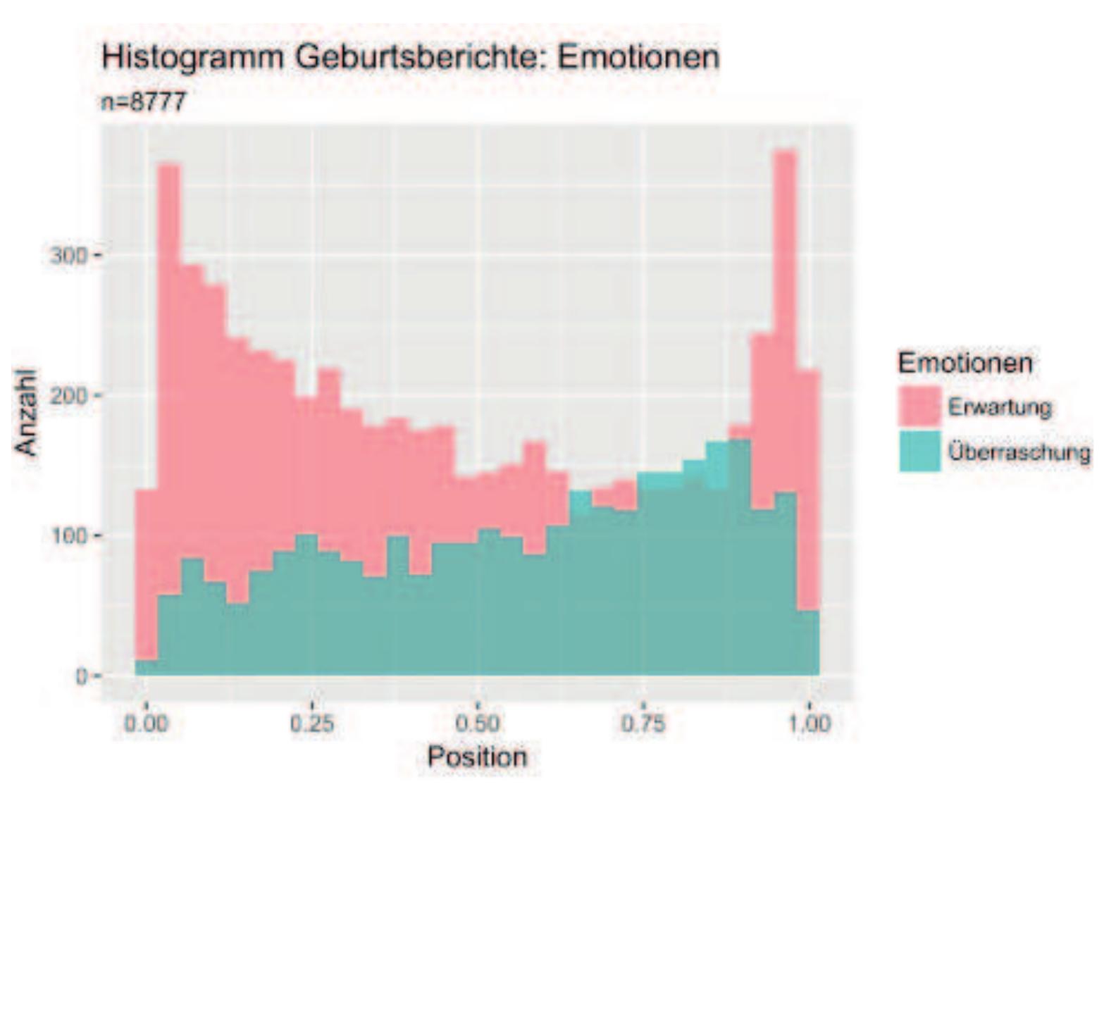
-Als dreidimensionale, interaktive Visualisierung, die die n-Gramme als Streudiagramm zeigt mit folgenden drei Achsen: Die x-Achse zeigt die durchschnittliche Position, die y-Achse die Häufigkeit des n-Gramms und die z-Achse gruppiert auf Wortformen-Ebene ähnliche n-Gramme. Abbildung 2 zeigt ein Bildschirmfoto dieser Visualisierung, wobei die statische, gedruckte Version unzureichend ist. Erst in der interaktiven Version entfaltet sich die Nützlichkeit der Visualisierung.
-Weiter entwickelten wir eine weitere Visualisierung, die auch die signifikanten Verbindungen zwischen den n-Grammen wiedergibt (Affolter 2016
Dreidimensionale, interaktive Darstellung der n-Gramme auf den Achsen Position, Frequenz und Ähnlichkeit
Die Mittel der Visualisierung sind ein diskussionswürdiges Thema für sich, auf das ich in einem anderen Beitrag ausführlicher eingehe (Bubenhofer im Druck b). Die Visualisierungen dienen der Datenexploration, da die zu analysierende Datenmenge zu groß und unübersichtlich wären (vgl. dazu auch Bubenhofer 2016, im Druck a).
Stabilität und Variation der Geschichten
Für jedes n-Gramm berechneten wir, an welchen relativen Positionen in den Geschichten es vorkommt. Daraus ergeben sich ein Mittelwert und eine Standardabweichung davon. Abbildung 3 zeigt nun für die häufigsten 1609 n-Gramme die Korrelation von durchschnittlicher Position und Standardabweichung. Auf der x-Achse ist die Position, auf der y-Achse die Standardabweichung abgetragen. Jeder Punkt symbolisiert ein n-Gramm; je höher auf der y-Achse dieser liegt, desto unklarer ist dessen Position in den Geschichten (höhere Standardabweichung). Eine Reihe von bezüglich Position besonders stabilen und instabilen n-Grammen ist beschriftet. P08
Es zeigt sich nun ein generelles Bild, wonach besonders am Anfang und Ende der Geschichten die n-Gramme eher stabile Positionen einnehmen, in der Mitte jedoch nicht. Das ist plausibel, da der Anfang und das Ende von Geschichten oft formalisierter sind als der Rest. Interessant ist jedoch, dass n-Gramme, die den Akt des Nabelschnur-Durchschneidens («Mein Mann schnitt die Nabelschnur; durfte die Nabelschnur durchschneiden» etc.) beschreiben, deutlich (und stabil) am Ende der Geschichten vorkommen. Das Skript einer Geburt ist ja aber mit dem Nabelschnur-Durchschneiden noch längst nicht zu Ende; die Nachgeburt beispielsweise könnte ebenfalls wiederkehrendes Thema sein. Das ist in vielen Geschichten jedoch nicht der Fall.
Dynamik
Erste Hinweise zu narrativen Mustern ergeben sich durch die Analyse von Korrelationen zwischen sprachlichen Oberflächenmerkmalen wie Wortartklassen und Tempusformen und ihren Positionen in den Geschichten. After the birth, the roles of the characters is reorganized: the mother-child dyad gradually becomes a single and indivisible unity and the other presences fade or disappear (Barbieri u. a. 2012, S. 16).
Die 1. Person Plural könnte als Anzeichen für die Konstruktion der «unteilbaren Einheit» gesehen werden -allerdings ist die Wir-Form auch am Anfang der Geschichten häufig, wo es den Partner inkludiert. Die Enden ähneln dann wieder in einigen Aspekten den Anfängen, wobei die hohe Adjektivdichte die bewertende Funktion indiziert.
Narrative Topoi
Die dreidimensionale Visualisierung der n-Gramme (vgl. Abbildung 3) erlaubt nun eine Interpretation der Daten, indem Gruppen von n-Grammen, die im dreidimensionalen Raum zusammenstehen, gemeinsame semantische, pragmatische oder diskursive Funktionen zugeordnet werden. Wenn die n-Gramme im dreidimensionalen Raum clustern, bedeutet dies, dass sie an ähnlichen Positionen mit ähnlichen Frequenzen stehen und aus ähnlichem Wortmaterial bestehen. Natürlich sind das aber nicht die einzigen möglichen Cluster; gewisse Cluster lassen sich auch plausibilisieren, wenn sich die n-Gramme nur bezüglich zweier Faktoren ähneln. Hier zeigt sich nun der Vorteil der interaktiven dreidimensionalen Darstellung: Kippt man das Diagramm so, dass man es beispielsweise von «oben» in der Draufsicht ansieht, verschwindet die y-Achse der Frequenz und n-Gramme stehen nah beieinander, auch wenn sie nur bezüglich Position und Wortmaterial ähnlich sind, nicht jedoch bezüglich Frequenz. So können die Daten aus unterschiedlichen Blickwinkeln exploriert werden.
Diskussion
Die Datenpräsentation oben umfasst bereits bedeutende interpretative Schritte, die bestimmt da und dort angezweifelt werden können. Trotzdem möchte ich nun eine noch abstraktere Interpretation vorschlagen und die Beobachtungen in ein Modell des Geburtsberichte-Narrativs zusammenfügen. Abbildung 9 zeigt dieses Modell: Die Anordnung der Elemente von links nach rechts entspricht der ungefähren Position im Verlauf der Geschichten. Im Zentrum stehen die aufgrund der n-Gramm-Analyse erfolgte Kategorisierung in narrative Topoi (kleine Rechtecke
Egozentrierung
Wenn in den Erzählungen die Austreibungsphase geschildert wird, nimmt das Schmerzvokabular nochmals zu. Zudem sind die beiden narrativen Topoi ‚Gefühlsvergleiche und Grenzerfahrungen' sowie ‚Verzweiflung und Kontrollverlust' typisch, mit denen die Unbeschreiblichkeit des körperlichen Erlebens narrativ bewältigt wird. Jetzt treten bei den Verben die Personalformen der 1. Person Plural stark zurück (dafür ist eine leichte Zunahme der Ich-Formen zu beobachten) und die anwesenden Personen treten in den Erzählungen weitgehend zurück. Narrativ findet eine Art der Evaluation statt, mit der der erzählte Geburtsvorgang sozusagen angehalten wird, um die Unbeschreiblichkeit des Schmerzes zu beschreiben. Weil wahrscheinlich auch im Erleben dieses Moments jegliches Kontrollgefühl verloren geht, ist dies auch in der Erzählung der Moment, innezuhalten und dafür den Sinn des Erzählens zu thematisieren.
7 Es wurde dann manuell die Fruchtblase eröffnet und die Hebamme hat dann den Gebärmutterhals mit dem Finger zurückgeschoben.
Ich will es nicht schönreden: Das waren die schlimmsten Schmerzen meines Lebens. Aber ich wollte durchhalten und ich wollte vor allem eins: KEINE PDA. (https:// www.urbia.de/archiv/forum/th-4919394/das-ziel-einer-langen-reise-3.html) :
8 Dann drehte ich mich wieder um und ein paar wehen später war der Kopf endlich da. Sie hat sofort angefangen zu schreihen ob wohl nur der Kopf drausen war.#freu Eine weitere wehe weiter war sie auch da. Ich habe sie sofort in meinen arm bekommen.#verliebt Es ist ein einzigartiger unglaublich schöner momment meine Tochter das erste mal im arm zu halten. Sie war über und über mit käse schmiere voll. Sie ist am 21.09. um 07:14Uhr geboren mit 3270g, 51cm länge und einem ku von 34cm. Als die Plazenter gekommen ist, habe ich das nur so neben bei registriert. Ich war voll und ganz mit meiner Tochter beschäftigt. (https://www.urbia. de/forum/43-geburtsberichte/4909859-die-geburt-meiner-tochter-vorsicht-lang) 9 Von den nächsten paar Minuten weiß ich nicht mehr wirklich was, ich redete (na gut, ich schrie) bei jeder Wehe irgendetwas, von ich will einen Kaiserschnitt und ich schaff das nicht bis hin zu fuck und Aua. (https://www.urbia.de/forum/43-geburtsberichte/4903725-der-schonste-tag-mutmachpost)
Euphorisierung
Es gibt verschiedene narrative Topoi, die dazu dienen, die Resolution einzuleiten und die Erzählung fortzusetzen, so z. B. das Thematisieren der Presswehen (die sich von den vorhergehenden Wehen unterscheiden und von vielen Frauen offensichtlich als «angenehmer» empfunden werden, da sie das Zeichen für die Austreibung sind. Als euphorisierend wird auch das Befühlen des austretenden Kopfes des Kindes erzählt. Der narrative Topos der Geschwindigkeit («jetzt ging alles ganz schnell») gehört ebenfalls zu den erzählerischen Mitteln, die Resolution herbeizuführen. In dieser Toposklasse nehmen dann die emotionalen Ausdrücke der Freude, des Vertrauens und der Erwartung wieder deutlich zu, wie auch die 1. Person Plural bei den Verben. Viele narrative Topoi in diesem Bereich haben ebenfalls evaluative Funktion. Medizinische Komplikationen wie Blutverlust, Dammrisse etc. haben natürlich wiederum auch erzählerischen Komplikationscharakter.
10 Aber danach ging alles ganz schnell: Muttermund vollständig eröffnet, ich durfte endlich pressen..
Und um 0.07 Uhr am 23.5.17 war unsere wunderschöne und liebe Prinzessin nach 9 Presswehen geboren. Sie hat so tapfer alles durchgehalten, ich bin unglaublich stolz -auf uns beide! (https://www.urbia.de/archiv/forum/th-4919394/das-ziel-einer-langenreise-3.html)
Initiation
Hierzu können narrative Topoi gezählt werden, die bereits erzählerische Coda-Funktion aufweisen, also die das Erleben zusammenfassen und bewerten, die Rückbindung an die Jetztzeit leisten und die Abschlussformeln enthalten, in denen beispielsweise Wünsche an die Leserinnen gerichtet werden. Ich möchte diese Klasse ‚Initiation' nennen, da damit (vor allem bei Erstgeburten) die Aufnahme in den Kreis der Frauen mit (weiterer) Gebärerfahrung erfolgt ist. Dafür sprechen auch die narrativen Topoi des Stolzes und der Dankbarkeit, die aber je nach Kontext sowohl Evaluations-als auch Coda-Funktion haben. 13 Und es stimmt: es ist alles wieder ganz schnell vergessen. Ich empfinde diesen Tag als den schönsten meines jungen Lebens und erinnere mich noch immer jeden Tag mit einem Lächeln daran. Ich hatte ein super kreißsaal Team, war die meiste Zeit allein und konnte selbstbestimmt das tun was sich richtig angefühlt hat und auf meinen Körper hören.
Danke fürs Lesen wer bis hier hin durchgehalten hat, ich hoffe ich konnte der einen oder anderen Baldmami die Angst vor der Geburt nehmen -ihr macht das schon! (https://www.urbia.de/forum/43-geburtsberichte/4903725-der-schonste-tagmutmachpost)
Vielleicht kann man das narrative Muster des Geburtsberichtes als Erzählung über die extreme physische und psychische Körpererfahrung zwischen Selbstbestimmung, Fremdbestimmung und völliger Egozentrierung zusammenfassen.
Fazit
Meine Modellierung eines narrativen Musters von Online-Geburtsberichten ist hoffentlich plausibel, aber sie ist auch angreifbar und die Deutung könnte anders ausfallen. Auf jeden Fall ist meine Modellierung Produkt eines hermeneutischen Interpretationsprozesses von verschieden aufbereiteten quantitativen Daten, wobei ich versucht habe, sowohl die Datenaufbereitung als auch die Interpretation transparent zu machen. Mir geht es weniger um das im vorherigen Abschnitt präsentierte Modell, sondern darum, überhaupt das methodische Rüstzeug zu entwickeln, um Narrativen mit quantitativen Analyseverfahren gerecht zu werden.
Genau so wichtig ist jedoch die Erkenntnis, dass ein Erzählmodell flexibel sein und mehrere Ebenen abbilden können muss. Die strukturalistischen Erzählmodelle, wie sie beispielsweise von Labov und Waletzky (1973), Boueke (1995) und anderen vorgeschlagen wurden, sind reichhaltige und gut durchdachte Erzählkonzepte, jedoch besonders für einen quantitativen, datengeleiteten Ansatz, der von typischen Sequenzen sprachlicher Muster ausgeht, weniger gut ge-
Danksagung
Der Text entstand im Rahmen des vom Schweizer Nationalfonds geförderten Projektes «Visual Linguistics», bei dem auch Klaus Rothenhäusler und Irene Ma mitarbeiten.
Literatur Practical work
Especially in this case, a spatial installation could lead to a better knowledge transfer, since it provides a broader range of variables that can be accessed, partly very subtle and thus, with almost no effort of decoding. For this act of transferring, the use of appropriate interactivity, be it subtle or with the help of concrete translations or metaphors and not just digitally spoken, could help the viewer to reenact with the topic much better than a complex visualization with variables that require expert knowledge to discover their real meaning. There have been many nodes where statements of the quoted specialists prove this statement elaborately and give an example how this fact could enhance the process of knowledge transfer. Examples are for instance the use of epistemic interactions, as well as addressing the senses such as hearing and smell.
Referring to the topic of epistemic interactions and especially to the Tetris example of Kirsh and Maglio, this knowledge can also be used to intentionally foster an active examination of the topic in a challenging way. This can, when embedded and set up properly with interaction instructions and crucial hints how to approach this installation, lead to an active learning process by «thinking when doing» as Fast pointed out. Practically speaking, this means to find the right balance between providing information and leaving the discovery up to the viewer.
To come back to the book on your desk, this spatial approach could enable viewers to change their position into several directions in order to gain multiple images. They could touch the material and thus, learn that it is made out of paper or tell from the sound it makes when opening it or flip a page. By layering all those perceptional images, they can not only tell that it is a book but obtain more profound information, such as which thickness or feel the paper has, how it smells, and how heavy it is. Due to that, a more profound and complex understanding of the subject «book» can be fostered.
Practically, the installation could be a kinetic installation with several balls, in which every ball symbolizes one data point. To carry out the temporal classification, some kind of parkour could be thought of, which the visitor paces out. The farther he precedes and experiences the story, the more progress he makes in the birth report itself. To enhance the immersion, video, as well as sound, can be taken into account.
This spatial installation will be created for this particular data set of a linguistic analysis of 14.000 birth reports and shows an exemplary realization of such an installation. It does not claim to be adaptable to every data set without adjustments; it rather suggests how this spatial installation can be tackled and realized and what this spatial approach can contribute to the particular research field in terms of enhanced knowledge transfer. It will not be the solution for a visualization in space, but rather a possible way which creates one of a mere endless amount of perspectives, also taking into account digital visualizations and possible findings from a mere table of values, of how to interpret the data set.
Gathering information
In order to enhance, verify, and unravel additional information regarding the graphical principles I compiled through the research (chapters 2.1.3, 2.2.6, and 2.3.1), I prepared an extensive survey. Taking into account other professions and people who are not working in this field is a crucial point, as they provide a general understanding of a data set or visualization, not merely a very specified perception of the subject that, for instance, a researcher in the field of Linguistics would have.
I asked the participants about their background and the resulting perception of data visualization. Other questions were what they associate with time and birth and also, which interactions they think of when hearing these terms. The answers to these questions should provide a general understanding of how the given topics are perceived and with which metaphors people work in order to understand these topics. Therefore, these statements can be taken as a base to start and to built a concept for the spatial installation from.
A second part of the questionnaire gives three examples [I07][R06][R19] of visualizations and asks if the survey participants could get the content, in which amount of time they managed to do so and what could have been done better. This is crucial information to find weaknesses and strengths of these visualizations an learn from these.
The result of interviewing 29 creative people shows that 86.7% have been in touch with data visualizations so far and that the majority thinks that the examples would benefit from an experienceable installation (Ex. 01: 12 out of 15, Ex. 02: 6 out of 15, Ex. 03: 9 out of 15). This means that although they have been using it, it was not a satisfying experience in terms of knowledge transfer, especially when it comes to emotionally connotated topics like birth and time.
The graphical image of birth was mainly a very emot ional state or shapes which are hard to grasp within a complex picture. Main outcomes were thus «something light, soft, clean, and smooth.» As a concrete graphic element, «circles» were mentioned very often as well as «dots + waves.» Not very surprising were several mentions of «baby.» When it comes to «time,» they stated something very complex such as a «perpetual movement» or a «spiral» but also with basic shapes or concepts such as circles or lines and rotation. Of course, «a clock» or «a watch» were also mentioned.
Metaphor-driven prototype I09
Interactions of this topic were something really interesting. Basic interactions such as «touch, tap» and «press» were also mentioned very often. This could be used in the installation as well to convey or communicate a concrete part of it. For instance, further information about a particular n-gram. R38 When it comes to more complex concepts, the interviewees described mostly very emotional scenarios like «coming from a dark narrow space into a bright light» or «holding hands» and «touching something warm.» Further mentions were «walking and / or moving on» and «going forward.» Probably associated with the graphical image of a watch, they also said «tipping on watch» and «rotating.» Another interesting statement was «consistent stream.» These statements allow the conclusion that this topic and its mediation lives strongly from an emotional aspect. This emotional aspect is the core part of the spatial approach that has to be created, because the more immersive the experience, the effective the knowledge transfer. This means the more senses are addressed, the simpler the decoding of the information of the topic and, additionally, the more variables are available for conveying the topic. Furthermore, these statements provide an indication of how a spatial enhancement could look like.
According to George Lakoff and Mark Johnsen, using a metaphor works best if it correlates with the physical phenomenon it wants to describe Metaphors we live by;2003: 18] and if it bears some kind of reference to the culture it is used in «Metaphors we live by»;2003: 21]. A possible metaphor would be the topic of giving birth or telling stories about giving birth, as those topics are firmly connected with emotions and thus, create a very good node for tying in with sensual extensions as a basis for a spatial installation.
Metaphor-driven prototype
With this information on hand, I spatially sketched a very rough concept of this first approach. It uses the interaction of time as a path the viewer could walk upon and pass different stages of the birth reports. The whole room setting is held in dark with very subtle lighting which will be mainly used to communicate the feelings of this particular moment of the story. The core of this parkour is a room that works as a metaphor for the moment of birth itself. Practically, this room will be created out of styrofoam to create a warm and bright space, due to the insulation properties and color of the material, separated from the dark rest of the parkour. Entering is possible through some kind of a door which plays with the associations of a vagina. Since birth is a very complicated process, it is hard to pass. Inside, there are seating opportunities to establish a comfort zone for the visitor where he can sit and relax and watch the «baby.» This baby is an undefined object till now, but it can be thought of as a parametrically designed 3d-printed object, perhaps manifesting a variable of the data set. It will be presented in the middle of this area on a plinth with an acrylic glass cover to symbolize the incubator. Additionally, an infrared heat lamp will be used to recreate the warm, cuddly, and happy feeling right after the baby was born. I09 This very metaphor-driven approach takes into account most of the survey results and embeds them to create the experience. When examining the effect of this pathway, I quickly concluded that it is rather a representation of the birth itself than a reflection on the linguistic research results. The data set was almost not implemented in this approach but what kept me going to execute this first version of a concept was to know that this is a first approach and iteratively reflecting on it will bring me closer to the knowledge what is missing and what is too much. Only by doing so and a prototypical creation of the possible experience, I was able to reflect on it.
R38 N-Grams are fragmented pieces of a text or a sentence. These single or multiple words, parts of sentences or whole texts are known for their usage in computer linguistics, as they are crucial for statistical analyses.
Bubenhofer, Noah; Top perspective of the digital visualization showing similarity clusters
Interactive Website / Web application Available from: http://www.bubenhofer.com/narrviz/geburtsberichte.plot3d. top481.html.
I10
Similarity cluster of the data set mapped onto the physical realm and thus, creating a spatial dramaturgy I11
The data set as a data base
Coming from this very emotional and experience-based side of how to approach this topic, I found myself in a very data-driven approach since a merely metaphor-driven approach carries the concept of exformation within. This means that a story, a word or an image already carries its own story and associations within itself. The more images and associations arise when listening, the more exformation the statement has. In simplified terms, information is width and exformation is the depth of a text or a statement. For instance, the numbers 9/11 already trigger a direct association of the incidents of the plane crashes into the World Trade Center on 11th of September. The figures 44 / 45, indicating the years 1944 and 1945, are also directly related to the years of the Second World War in a reader's mind; especially when he comes from countries that participated or suffered from this war. R39 This concept, on the one hand, helps to mediate information in a more effective way since the underlying associations are carried without any effort; as a byproduct so to say. This can also be unconducive when it comes to explorative products, services, or installations because the users, viewers, or visitors are particularly biased with this underlying image and are no longer able to leave that behind and explore the topic from scratch. Taking this fact into account, it was obvious that my work cannot be a mere metaphor-driven realization and thus, a recreation of the moment of birth in an experienceable way per se but rather something more abstract based on the actual abstraction of the data set with the objective to visualize the underlying narrative pattern of these utterances in the birth reports.
Taking this literally, I used the visualization of Noah Bubenhofer R04 and explored it in a more profound way to get a feeling for the dimensions. My primary consideration here was to find parameters to group certain areas logically and thus, achieve a simplification not only of the visual impression but also of the representation of the data. With the help of this visualization, I was able to get an understanding of the similarity of the data: utterances belonging semantically together are grouped in so-called clusters.
When zooming out entirely and turning the visualization to see its top I10 which in this perspective shows similarity clusters, 11 main clusters or, often also referred to as «topic islands,» such as «pain descriptions» or «Hello my loved ones» can be identified. From this approach, it is possible to perceive that the underlying pattern is the data itself. This fact embodies a spatial representation of the data and its associated processes based on the data set itself but also makes it possible to address the emotional component of, let's say, pain with the help of these clusters.
By doing this clustering, I firstly created a data-driven dramaturgy and secondly, was able to think of a reasonable way how to embed a parkour for the visitor. Parameters were that the parkour does not reveal the whole installation and all clusters at once but rather keeps some kind of an explorative character which was crucial for the project. Only by following the parkour around its curves, the visitor can discover the last islands. Thus, a more concrete and simplified concept of these clusters, which is based on the similarity clusters of the visualization, was created. I11 This methodology indicates and defines which role the data set of the birth reports plays within the process, the development of the concept, and the prototypical explorations. I have been focusing on using the existing visualization by Noah Bubenhofer as a prototypical data plot to use it as a base for the spatial installation. I worked with the parameters and axes in order to understand the spatial mapping and use it as a general thought model to provide an access point to this specific research project and outcome. This leads me to the point of clearly stating and situating my work not as a spatial data visualization but as a data-based installation which translates the character and the content of the data set into a spatial installation and, additionally, mirrors the processes within the data handling procedure. R39
Contradictions discovered within the project I12
Contradictions
In a further step, I had a discussion with Mirjam Steiner who previously studied German language and Literature studies and is now a research assistant of the specification of Interaction Design. While discussing, we discovered some very interesting contradictions of the project. For instance, of how emotional those single stories of births are and how they are opposed to this schematic depiction, firstly in the visualization and secondly within the data analysis itself since this procedure is usually a method which is based on quantified points of view as well as the whole research proceeding of Corpus linguistics. Additionally, it is necessary to collect and analyze these statements in order to derive an underlying pattern of language usage.
The questions that are coming up are, for instance, «Is this way of translating individual emotions into words and further into a data model correctly depicting the meaning of these statements?», «What happens to these fragments of statements when this translation process is used?», and «What is happening with the whole character of these statements in my process of translating these words into the data model and back into an analog way? Is it helping it? Or rather abstracting it?» Another interesting contradiction is the fact that these feelings and mentions are mostly so strong that the women are nearly unable to express these or make others understand what they felt in this moment. According to Elaine Scarry, this is a particular phenomenon of pain as it is only happening in an individual's body and if this individual feels it, it is in most cases not possible to make the others understand how this pain feels. This is the reason why we speak in metaphors to express what we feel, but these metaphors can never precisely describe how it feels [Scarry, Elaine; «The Body in Pain: The Making and Unmaking of the World»; 1985]. They are rather an alternative image of something that is known commonly and that we use to give our listener a hint how it could feel like. This inexpressible pain, also occurring in the process of giving birth, immensely contrasts with the linguistic research of exactly this moment. Some more contradictions are the following: I12 emotional event clinic and cold surroundings, schematized procedure (geburtshilfliches skript) stories are reflection of birth installation enables visitor to experience this story live in this moment translating individual and analog translating digital visualization into an utterances in digital visualization analog experience
Since these contrasting concepts are always referring to the same topic and have something in common but expressing opposite concerns towards this topic (otherwise they would not contrast with the other), they create an area of conflict that is worth to discover. These discoveries can as well help to formulate a visual language for this installation to cover some of those contradictions or, more important, communicate that these contradictions exist.
These considerations also spanned a possible visual appearance which features the contradiction of a threefold change of an analog utterance of the women to a digital visualization and thus, generalization and quantification and from there, back to an analog way. This translation process can itself be translated and categorized into three conceptual layers that represent the levels of abstraction of the data within the installation and can be used as a visual substrate.
Experience-driven prototype
A first spatial mapping (1) led to an intense prototpying phase with testings of the whole appearance (2), sandblasted tiles (3) Experience-driven prototype with video as immersive component I14
Taking these findings from this iteration phase into the process means embedding these contradictory aspects as well as the mentioned substrate into the whole appearance.
This concretization of the concept was accompanied by a prototypical production of acrylic glass tiles to use them as a first prototype for a representation of the statements. I chose different colors (red and translucent) and sizes in order to cover a wide range of possible outcomes, for instance, for color codings to visualize a particular value of the data set.
By hanging these tiles from the ceiling in different heights, they can be overlapped. This overlapping of colors and shapes can be made visible with the help of light falling from above through these test tiles. By using several colors, several positions, and different hanging methods, the appearance and transparency, perceptional exformations raised, and the general visual effect could be tested.
Mounting a projector at the ceiling not only enabled me to use Projection mapping and thus, to illuminate the tiles in a very controlled way, it also enabled me to see that this creates individual patterns on the floor, varying in size (due to the hanging height) and color (due to the colors of the tiles stacked upon each other). Thus, another interesting aspect directly concerning the data set can be visualized.
Through using acrylic glass in this set-up, these layers not only display the transformation process but also visualize a variety of underlying statements and raised questions that I discovered while working with the data. The tiles themselves display not only the women's statements of the actual moment of birth in the form of them hanging from the ceiling. They additionally visualize two other aspects. Firstly, the projections on the floor, due to the transparency, the color of the material, and the overlappings, represent the pattern that is left behind by the statements and which was discovered by examining these statements with Explorative Data Analytics. This means they symbolize the data abstraction and the derived language patterns found by Noah Bubenhofer et al. Secondly, the reflective aspect of these statements is visualized as a reflection on the ceiling due to the surface conditions of the acrylic glass. I13 Furthermore, the choice of material is influenced by another consideration which was the usage and the production process of the material itself. Nearly everybody uses it, but almost no one knows in detail how it is produced. This highly relates to the topic of Linguistics as we all use language and thus, underlying patterns and do not really know something about current research.
In a further step, I experimented with the chosen material and explored its boundaries. Sandblasted tiles, for instance, are reflecting on the untreated side but lose their transmissive character. This outcome can be used to create explanatory elements only used to display videos or to be used as an interaction tile.
Furthermore, video and sound are other important parts of the project that are worth examining, since these media are considered to be essential to provide an immersive experience in order to communicate the topic. Stating this, I explored the immersive potential of these tiles. I used Mad-Mapper for Projection mapping to map the reflections precisely on the tiles and started with example videos of the program mapped onto these tiles to explore the effect of using «mood videos»; videos that help to convey the feeling of the particular topic islands with immersive visuals. Here, for instance, organic shapes that flow slowly an be used. Together with sound and maybe changed floor conditions, an immersive experience of a particular topic island can be created. I14
Experiments with materials to explore a contradictory behaviour
Silicone as a base layer, enriched with aluminum powder, carbon pieces, carbon pieces and aluminum powder, and fiberglass (upper left to lower right)
I15
Method stacking
For further conceptual contemplations and refinements, I met with fellow student Anina Riniker from Industrial Design. Since she is dealing with the topic of the vagina, our topics are related and we decided to brainstorm together and give us feedback to our current states. We started with a quick recap in order to firstly refresh what we are dealing with and secondly, to practice the presentation of our projects. When entering our «office» for this day, we encountered some post-its of a previous group and decided to embed them into our brainstorming process. We took post-it by post-it and formulated our associations with the term written on it or how this term could relate to our projects. This was a great and refreshing perspective on mind mapping and brainstorming which helped a lot in terms of opening up the concept again and allow other influences. Doing this together even enhances this fact since the other person has often different associations with the same term.
Excursion: contradictory material
The contradictions discovered were something that, in my opinion, has huge potential and what could be implemented or examined even further. Not only for the project itself but to gain a deeper understanding how contradictions can be expressed with the help of material in general and which possibiIities and limitations I am bound to, especially when working with translucent material. For that reason, I experimented with material probes that may look massively different than they behave or feel or the other way around. For instance, silicone appears in its texture as body-related. This material seems unstable but adding aluminum powder to it creates an entirely inverse association. I15 This contradiction could be used to firstly make the visitor aware of these and, more profoundly, they generally provide a broader understanding of the procedures and steps within the process; particularly when asking more questions such as «What does it tell data wise?», «Which structures are visible?», and «Could this be applied to the data set?» On the other hand and coming from the data set there are questions of «What does the data set tell material wise?», «Can these contradictions of a data-driven perspective and individual, tangible, and analog material studies contribute something?» This enriches the work tremendously as the material has a particular importance since it is used as the main conveyor of the message.
Within these considerations, I studied the work of artist Pe Lang, R40 who is mainly dealing with these questions and has a solo exhibition running at MuDA, Zurich. R41 He is mainly known for his material studies and installations which display the material on hand from another perspective and assign it mostly contradictory and unexpected properties. This provokes a more profound and more detailed contemplation about material and its boundaries as well as its operational area.
Iteration
After having defined and prototyped this main concept with some details, I saw the necessity to iteratively go through the current concept. In order to do so, I asked myself critical questions to improve or strengthen it. Thus, I am able to find the missing parts and answer questions that are still open. I explored and noted my main messages which I want to achieve and things which I definitely not want. Further on, I started with how I could avoid the things I do not want, such as «people not interacting because the installation looks too fragile». The next step was to think about how I could achieve to express or communicate my desired messages such as «see the underlying pattern.» For both steps, I tried to open my mind again and to think of different ways. While doing so, I discovered that some answers of both sides are the same. Answering how I can avoid something can support conveying the message. While some aspects such as projection and the use of light are the same, some others are crucially influenced. This ranged from mate- R40 Lang,
Refined version of the installation, arranged in a strict grid I16
rial considerations to rearranging the tiles and to a different approach of realizing it. What can be seen here on the sketch I16 is a general simplification. The different clusters are not fixed areas in size but are rather defined by the elements they carry. These elements are up to 5 tiles of the size 10 per 10 cm; forming one stack. This way, I am able to represent the number of occurring statements of one topic accurately. The size of the area is thus defined by the number of stacks inside. Furthermore, this leads to a quantificational and schematizational appearance which mirrors the processed data set accordingly as it shows individual stacks which are arranged all in the same way but display a different pattern due to the height of hanging of each tile.
The height of the tiles varies according to the frequency (= no. of instances, column K) in the data set. The higher the frequency, the higher (distance to the floor) the hanging. This leads to an enlarged projection for the tiles hanging at the highest point and thus, a landscape is created that directly refers to the actual values of the data set.
Another important point were considerations about the interactivity of the work. One of the three key topics in my thesis is the interaction part in which I express the advantages of adding epistemic interactions in order to ease access to a particular topic. These interactions are mostly subtle and intuitive, strongly connected to the actual analogy in the physical world and can immensely help to achieve this complex mediator task more profoundly.
Contemplations about interactivity + prototypes
Interactivity through adjusting the tiles.
I17
Adding experience: Epistemic Interactions
In order to define these interactions, I contemplated about different approaches of enabling the visitor to interact with the installation. Some of the prototypical sketches are dealing with understanding the whole parkour as an electrical circuit with, for instance, resistors, transistors, and capacitors. Applied onto the project, this could mean to implement a semi-structured parkour with obstacles to force an examination with the installation and the topic. For instance, the project could be built with elements that narrow down the more the visitor gets into it. In the end, there could be some kind of reward for taking this effort: learning what it is about. This way, a natural dramaturgy can be created by a simple interaction like walking. This could allow the visitor to position himself within this semi-structured setting and through this change of perspective, form an interactive part. As an example, the «Denkmal für die ermordeten Juden Europas» in Berlin, Germany can be stated with its thematically influenced architectural conditions.
Another option was winding the tiles up and down to show two different states of the data set, letting the visitor adjust the light intensity, or rearranging the tiles himself. I17 This proceeding would change the visual state of the data set, which would indicate that the composition and arrangement of the data set are alterable. Due to the previous processing and procedure of the Linguists, this is not the case. Only the interpretation and the perspective onto that processed data set remains alterable, which crucially changes the research results. The data itself remains untouched.
This led to the realization to not change the position of the tiles but rather to embed epistemic interactions as stated in my thesis through referring back to the survey I conducted in the beginning. As explained in detail, people associated interactions of the topic «time» often with «walking or «spirals.» I used these statements and embedded them as a base for interactivity. This means that visitors interact with the installation through walking upon the semi-defined parkour. This semi-definition uses the definition of the interaction of the circuit concept and thus, serves two purposes. First of all, the visitors are able to explore the installation but are limited in the spatial range of their interactions. This fact mirrors the appearance and properties of the visualization and the data as stated above. It is possible to interact with and to explore it, but only within the boundaries it allows to do so. For instance, there is no possibility to rearrange or filter the data.
The second purpose is to enable the visitors to understand the chronology and the sequentiality of the clusters. This was a main objective in this work. The start of the installation with the first cluster marks the beginning of the history and the last cluster marks the end of it. This is enhanced through the sound component that will be discussed in the following paragraph «Sound», which in the beginning, serves as a hint but with the progress of the parkour, the visitor can assemble all those hints into a greater picture and leaves the installation with his own interpretation of a birth story and his own understanding of a narrative pattern.
Sound
The second part of the interaction concept is the use of sound, as it was one of the first essential thoughts, also stated in the thesis, to implement a sound component as an interactive part. I considered samples of sounds that fit the clusters and are distorted by filters to create a soundscape. These filters can be triggered by the values of the data set. Therefore, I introduced myself to MuLab, a sound editing tool as well as PureData's possibility to export MIDI strings. This was a first outlook on possible sound producing opportunities.
In a further step, I had a discussion with Florian Dombois who is not only the head of the Master of Transdisciplinary at ZHdK but also an artist working at the intersection of science and art. We acquired the concept to use the installation layer with the tiles itself as a representation of the data structure and to create some kind of an entry point, in this process often referred to as a «rabbit hole», which enables the visitor to use this specific sound stations to gain a deeper insight into the topic. These stations can be realized with sound devices which play the specific
Sound device prototype
The box contains the speaker which plays the TTS-generated utterances. This massive appearance has to be replaced with something more soft.
I18
statements of the particular cluster in order to enable the user to find a connection between the hanging acrylic glass tiles and the sentence fragments. This also enhances the chronological perception of the parkour and the installation, since the visitor will be led through the whole data set of the birth reports step by step. Only when reaching the end, he will be able to assemble all these statements and make sense out of it. I18 Practically spoken, this sound utterances will be pronounced by a text-to-speech application to generate one sound file for every cluster; reading out loud every example with a repetitive computer voice. This computer voice is due to the TTS application and shows the discrepancy of the emotional statement itself and the schematic and algorhithmic methodology of assembling such a data set. Furthermore, every cluster is a thematically clustered gathering of the statements, based on the similarity clusters in the original digital visualization. This means that all the statements of one cluster have more or less the same meaning. Maybe one word is different or the way the words are arranged, but all in all, the same meaning is stated. Having this extract of one situation expressed in multiple ways as a sound component, firstly creates a repetitive moment because this TTS app will pronounce most of the words the same and secondly, I am able to underline the visual image of the tiles stacked upon each other with the help of this repeating statements and thus, additionally, make the pattern perceivable through sound which underlines its existence and importance in the work. Therefore, the visitor is able to connect his observations and perceptions of the data structure with the utterances of the birth reports themselves.
Hanging prototypes 1 Steel bar 2 Steel cord 3 Acrylic glass stick Hanging prototype with final hanging method Cable sleeves are used to create the layers which carry the tiles.
I20
Explorative Spatial Analysis 98 Advanced hanging sketch based on previous grid layout; with sound component I21 Advanced hanging showcased with 5 stacks Roof laths ease hanging and contribute to a strict grid I22
Hanging
In this state, after the refinement of the concept and the prototyping of the single components such as acrylic glass and sound, it was essential to work on detailed practical questions such as hanging in order to start producing the final prototype. I explored several hanging methods and my focus here was on finding a technique that is a) not disturbing the projected appearance too much but still displays the constancy of how these statements are interpreted and b) practical in terms of assembling since I will have to make 88 of these stacks (the current top 419 of the data set divided through 5 items per stack = 88).
Options I experimented with were steel cable, threaded bars, and acrylic glass sticks I19 but decided for nylon cord, although it is a particularly time-consuming hanging method, because of the shadow production and general appearance of fragility on the one hand and schematized and inalterable setting of the data set. I20
In terms of defining the projector hanging height as well as the exact hanging height of the tiles, I defined the area which is available for illuminating all 88 tiles. Since I intend to hang the stacks at a maximum height of 1 m above ground to call the visitors to change their posture and their perspective in order to see the pattern, which is a translation of the interpretation process done in the linguistic research and thus, a smaller scope of the whole work (EDA, chapter 2.2.4). I set the minimum hanging height to 30 cm. The stacks themselves will be max. 40 cm. Taking into account that the projected area gets significantly smaller due to the angle of field of the projector, I calculated how big the remaining space would be at this minimum hanging height.
Knowing that this model of short distance projectors generates a projection of 1 m per 50 cm projection distance and placing the projector 2.50 m above ground (max. height with remaining space for the grid above), I calculated the size of the remaining area that is necessary to illuminate every whole stack at a hanging height of 30 (2.50 m projector height -70 cm total hanging height = 2.02 projection distance). Using the information of the projector results in 4.04 m x 2,27 at an aspect ratio of 16:9. Since I divided the whole area into four smaller areas with one projector illuminating each in order to obtain enough light intensity, these values have to be multiplied by 2. This means the area that is available for the actual installation at a projection distance of 2.02 m is 8,08 m per 4,54 m.
Since I previously set the size of the tiles to 10 cm 2 in a grid of 10 cm (distance to each other), which equals a total size of 5.00 per 3.80 m, there is enough space to illuminate all the tiles with max. 40 cm per stack at a hanging height of 30 cm and a projector height of 2,50 m. Resulting from this, the maximum hanging height of the tiles at a total area of 5.00 m per 3.80 m is 40 cm, which results in an illuminated area of 6.80 per 3.82 m.
After these dimensions were defined, it was necessary to develop a fundamental hanging system in order to hang these 88 stacks efficiently. This system provides a foundation to construct a grid that can be used for attaching these stacks accordingly. The room width of 6 m made it necessary to use 1.5" aluminum bars to establish a stable foundation.
Furthermore, an efficient proceeding was created to simplify hanging the tiles. It is intended to use a wooden tile on the very top of each stack to keep the nylon cords sorted. This tile can be used to quickly attach the stack to a roof lath which is laid onto the grid at the ceiling. I21, I22
Exhibition concept for 5.K07
A slipcase for the documentation as well as a tile provide first informations that encourage visitors to enter the room 6.K02
I23
Slipcase out of acrylic glass for the documentation (Representative image)
I24
Exhibition
Since the main part of the exhibition is the installation itself, experienceable in room 6.K02 at ZHdK, I am using a teaser in the official Interaction Design space in 5.K07. This teaser is giving a short introduction to the work, provides further information about the room and the opening hours, and tours of the installation. I23
In terms of visual appearance, the teaser is oriented towards the installation and its material contemplations. An engraved acrylic glass tile in the color used in the work is carrying the introductory information as well as the room number and guiding hours. Additionally, this detailed process documentation with the thesis and a detailed report of the proceeding of the data set on hand included is provided within a hanging slipcase out of acrylic glass, I24 I and red tape will lead the visitors from their current location to the actual installation.
For the work itself, I am offering recurring time slots in which I will open the room and, if desired, give an extended tour. This decision is motivated by the work itself, as it carries a repetitive aspect with it, visualized with the stacks and the sound files.
Producing the final stacks
The value of the frequency of each n-gram, taken from nr. of instances in the data set, is mapped onto the distance of each tile to another. Thus, every tile is stacked according to its frequency.
I25
Explorative Spatial Analysis 105 First final stack in fluorescent red I26
Complete layout of the final installation
This top shot of the whole installation shows the hanging foundation with aluminum bars (magenta) with the roof laths (green) and the stacks (translucent). The position of the sound devices is indicatved in grey. The visitor enters on the bottom side, walks through the installation and leaves on the upper left side between C10 and C11.
I28
Conclusion: Results
The final work is now uniting the findings of research, prototyping, and iteration and manifests in a spatial installation that displays 11 clusters with acrylic glass tiles assembled to 88 stacks with five elements per stack. I25, I26 These 88 stacks are hung in a very strict grid that firstly indicates a dramaturgy and secondly mirrors the strict proceeding of the algorithmic data analysis. I27, I28
Eleven sound devices, one for every cluster, in the form of speakers are playing the utterances that belong to them in a loop. These utterances are sound files which were created with a TTS program, using the actual examples of n-grams of the data set. This computational display of these partly emotional statements is referring back to the algorithmic proceeding of creating this data set out of the big data of 14.000 birth results downloaded from the internet. I29
To interact with the sound devices, they are hanging from the ceiling next to their cluster. Visitors can use them like a phone and put it next to their ear in order to listen to these utterances. I27
The overall soundscape serves the underlining of this feeling when entering the room with this installation for the first time without knowing what is visualized or can be done in there. This strongly relates to the movie «Stalker,» R42 in which a guide leads two persons through an area whose physical conditions are continually changing. Additionally, the color of the tiles refers to the corporal topic the installation deals with and also emphasize this atmosphere through indicating a corporal or emotional topic due to the chosen color but contradicts through the choice of the material as well as the general appearance of schematization and classification of the installation. These aspects, in turn, refer back to encountering a topic or a data set for the first time without knowing which information it can reveal. Thus, it relates back to the previously introduced concept of EDA (Exploratory Data Analytics, chapter 2.2.4) which deals with exactly this initial state.
The title of the project, «Exploratory Spatial Analysis», also hints to this procedure, as this work situates itself as an exploratory prototype which intends to translate this data set on hand into a spatial installation and thus, evokes questions which may would have never been asked in the context of this topic, such as «Which material is suitable to represent the topic?» and «Which arrangement displays the procedure of the data handling?» I30, I31, I32, I33
The main objectives of this work are to raise awareness of these repetitive patterns of human language using the example of birth reports and additionally, raise questions about political implications and the way how this data set and data sets in general are created. Therefore, this work is a prototypical attempt to contemplate and reflect about data. It is nor a visualization tool, nor a data visualizstion per se or a complete display of the data. This installation is based on this data on hand and it situates itself as an introduction to the complex topic which makes no claims of being complete but rather works as a mediator between the researchers in the complex and profound field of Linguistics and people of other disciplines.
Speaking more concrete, 419 tiles were used in this work. This number equals the identifiable number of the data points visualized in the digital visualization by Noah Bubenhofer. R04 This is self-evidently not a complete display of the whole data set which contains 6942 data points, known as n-grams, which would generate an entire other image both in the digital visualization and in my work. There are two reasons for this proceeding. My work is firstly further processing the already interpreted, processed, and staged digital visualization, which is a model of the original data, the statements uttered by the women online. This proceeding has the objective to display this previously mentioned procedure of schematizing, classification, and abstraction that is common when working with data. Thus, a critical view onto these conventional methods is expressed.
Secondly, it mirrors the mediation itself, as it displays an extract of the whole information. This is only the peak of the iceberg, so to say, the visitor needs to get in touch with the topic. This is also where the distinctions occur, as a digital visualization can carry all 6942 data points with its exact information about the data and thus, often has the aspiration of completeness, whereas this analog spatial installation strongly aspires to provide apprehension about this topic. It is dealing with completeness, it is dealing with creating a possibility to understand through adequate communication of a topic and thus, reach completeness and complexity.
This mediation happens through adapting the level of knowledge, since overcoming these two sides of knowledge level is extremely hard for an individual. What helps is adequate mediation. My work builds on that and explores the mediation concepts of art and seeks to communicate with methods of the field of science. Thus, it can serve as this mediator and as a communication tool, as it deliberately provides another perspective. Meaning that it uses the research results of this data set and translates them into an abstracted and simplified form of communication to create common ground, which is the foundation of mediation. Thus, the parameters are shifted into an area that is accessible more easily for people with other backgrounds than Linguistics.
The shift to another form of communication and mediating is necessary in order to provide a space for the visitor to explore the topic. Only through simplifying and translating the matter into another context, it enables the visitors to create a base to build upon. Without that base, the sheer complexity of the topic would make it impossible for the visitor to acquire it and position himself. I34 This positioning happens very subtle and enables the visitors afterwards to talk about what they learned and thus, the installation fosters a dialogue about a topic which was previously not known in most cases. This helps immensely to create a prolific exchange for both Linguists and people from other fields to talk about something highly complex such as 6942 n-grams in a data set of 14.000 birth reports and their linguistic analysis regarding narrative patterns. I35
A practical example of this matter are so-called science days, for instance the «Highlights der Physik,» taking place in Ulm 2016, R43 where physicists provided experimental set-ups visitors could interact with in order to experience and learn about several physical phenomena.
Shift-of-field sketch in order to obtain a mediation layer I34
mediation layer A B
System of mediation
The intersection indicates the formation of common ground; the same language is used. Thus, transfers between the different knowledge areas within the topic are possible and content can be conveyed.
Related topics
DesignDigital HumanitiesSpatial AnalysisInteraction DesignCorpus LinguisticsNoam ChomskyData VisualizationFerdinand de SaussureExploratory Data AnalysisData HandlingBig Data / Analytics / Data MiningComputer LinguisticsBig Data VisualisationVisualization of Big DataData ProcessingMultidimensional visualizationData Analysis and VisualizationLambert Johann Heinrich