Summer Day FontLakeside Font GeneratorSummer Beach FontWater Font DafontLato FontPsd Mockup TemplateFont FamilyBold BlackPersonal BrandingDownload Lato Font Family 10-Weights - DesireFX.COM10 TTF | 673 KB DOWNLOAD WITH UPLOADCLOUD8
Lato TypefaceContemporary Serif Font StyleExtended Serif FontModern Bold Serif FontModern Elegant Variable FontLato FontWriting ScriptsSign FontsModern Sans Serif FontsLato Font#Lato #free #fonts #typography #type #typeface #design #web-design #font #lettering21
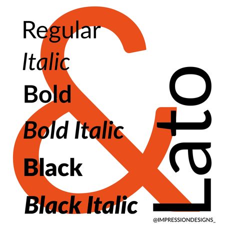
Bold Typography OptionsLato TypefaceHumanist TypefaceWide Bold FontFont Specimen PosterHumanist FontLato FontBold Font MemeTypeface PosterLato TypefaceMeet Lato. Lato is a humanist sans-serif typeface designed by Łukasz Dziedzic. It was released in 2010. The name "Lato" is Polish for "summer". Lato is used on more than 9.6 million websites, and is the third most served font on Google Fonts. Save this for the next time you are looking for an abstract ampersand!48
Font Pairing With MontserratMontserrat Font CombinationsMontserrat Font PairingLato FontCursive Fonts AlphabetMontserrat FontFree Cursive FontsTattoo Fonts CursiveDesign TypographyLato Font Combinations & Similar Fonts · TypewolfWebsites using the typeface Lato with personal recommendations for similar web fonts, suggested font pairings and the closest free alternative.12
Lato Font PairingLato TypefaceLato FontFree Cursive FontsFont CombosDesain EditorialFont DesignFont CombinationsFont PairingPLETÓRICA Designs Studio: Let's TypePletórica Designs Studio: A typography-focused, one-day workshop for designers, writers, and.#CoolFonts #TypographyLove #FontObsessed #CreativeType #FontFrenzy2
Lato FontCorporate FontsStrong FontTypes Of Graphic DesignLuxury FontSans Serif TypefaceCorporate PresentationModern Sans SerifStylish FontsGoogle Web Font Favorites — Andréa CroftsI learned this week that not all Google Web Fonts are ugly. Some are actually quite lovely. Web-based fonts have come a long way from a few years ago, in my early days of coding. There are many high quality typefaces available for free , with outstanding technical and visual characteristics; not1
Lato TypefaceSan Serif AlphabetSan Serif Fonts AlphabetSimple San Serif FontsElegant San Serif FontExtended Sans Serif FontsMagnolia FontLato FontBuy FontsLato ExtraLight FontLATO EXTRALIGHT FONT6
Lato TypefaceLakeside Font StyleLhf Lakeside FontSummertime FontSummer Lake TypographyLato FontFree TypefaceOpen FontsFree Fonts DownloadDownload free fontsLato | free typeface5
Top 10 FontsBest Google FontsLato FontUnique LetteringProfessional FontsGoogle FontsOpen FontsSans Serif TypefaceFont CombinationsLato from Open SourceExplore Lato designed by Adam Twardoch, Botio Nikoltchev, Łukasz Dziedzic at Adobe Fonts.5
Sabbatical Font GeneratorLato TypefaceCelebrant LogoLakeside FontSummer Lake TypographyTropical Summer FontLato FontGoogle FontsSans Serif TypefaceSabbatical Font GeneratorLato Font18
Best Google FontsLato FontCalligraphy Fonts HandwrittenTimes FontCursive Handwriting FontsCute Handwriting FontsCute HandwritingGoogle FontsOpen FontsBest Google Fonts For Web Design Projects « 10 Best Google FontsThis Post is a roundup of 10 best best google fonts for web design projects. you can find the latest and best 10 google fonts here , these are good for websites.13
Typography Fonts HandwritingFanwood Font DownloadIndustrial Script FontEdgy Fonts DafontWeb Design FontLato FontBielefeld Typeface FontBold Sans-serif Font AlphabetFont Lovefree script fonts, brush fonts, handwritten fonts | | Graphic Design JunctionLato Free Font #freebies #freefonts #branding #typeface #typography #scriptfonts #brushfonts #handwrittenfonts87
Fluire Font GeneratorFluire Font DownloadNeon Summer Font DownloadLato FontBold Sans-serif Font AlphabetInfographic PosterBest Free FontsFavorite FontsGraphic Design Tutorials85+ Most Wanted Best Free Fonts and Typefaces 2017This in the collection list of the best premium and free fonts 2017 in the flexibble.19
Naive Font GeneratorMf Doom Font GeneratorWoodcut Font GeneratorLato FontLolita Font GeneratorArte Pop UpBend Typeface Font GeneratorFlat UiSans Serif TypefaceNaive Font GeneratorLato font is a sans serif typeface family. It consists five weights: 100, 300, 400, 700, 900 plus corresponding italics. Lato gives users a felling of warmth as well as stability and firmness.5
What Is Opentype FontOpen Sans FontTanpa Kata FontCentrale Sans Condensed FontBold Sans FontHelvetica FontItalic FontRound FontBuy FontsMontserrat Medium FontMONTSERRAT MEDIUM FONT15
Lato Font Free DownloadFree Lato Font DownloadFonts For LogosFree Fonts For LogosLakeside Font GeneratorLakeside Font StyleLakeside FontLato Font CombinationsLato Free FontClean Free Fonts For Logos | | Graphic Design JunctionYou know great fonts can make a great logo. That's the important factor is generally known in the graphic designing realm as ‘font.’ When it comes to creating6
Lato Vs MarcellusMarcellus And LatoMarcellus Vs LatoFalling Slowly Font GeneratorLato Font CombinationsLato FontMarcellus FontMaxwell Slab Font12 Classic Squarespace & Canva Compatible Font Combinations For Your Website — Birch & Bud Design Co.Consistency is key across your marketing touchpoints. Luckily tools like Canva are making it easier to share quality graphics with your clients. But - you still want to ensure you’re not using just any old font all the time. In this post I share 12 font combinations available in both Squarespace &a8
Cloud TemplateCloud DriveStartup MarketingFont PairingBranding ToolsBrand AssetsSales PeopleMeasuring SuccessSocial Media SiteFont pairNeed some cool #fontpair? Here we go. Combine Monoton for headlines with Lato Light for body text. #fonts #inspo #designinspiration #colors3
Housewares DesignFont GuideStylish TextGoogle FontsText OverlayFree Fonts DownloadSans Serif FontsFont StylesDownload FontsLato RegularDownload Lato Regular font for free1
Comic Sans Font GeneratorReplete Sans Font GeneratorNoto Sans Font DownloadBold Sans FontLato FontBold Sans-serif Font AlphabetGlyph FontMinimal FontFree Handwritten FontsTeX Gyre Adventor Font Free by GUST e-foundry | Font SquirrelDownload and install the TeX Gyre Adventor free font family by GUST e-foundry as well as test-drive and see a complete character set.6