Donut chart

Discover Pinterest’s best ideas and inspiration for Donut chart. Get inspired and try out new things.
2k people searched this
·
Last updated 3d
a pie chart that shows the percentage of people who have been nominated for their roles

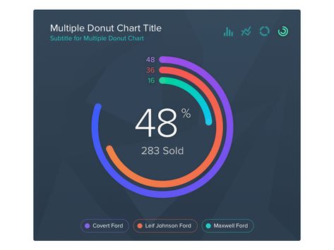
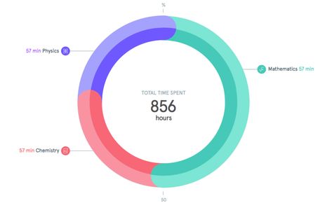
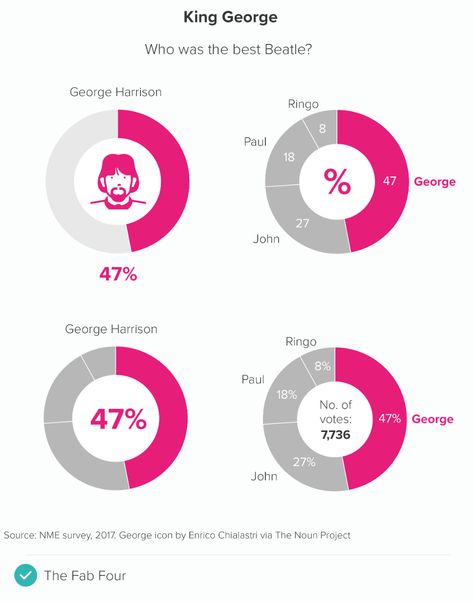
In this blog series, we look at 99 common data viz rules and why it’s usually OK to break them. by Adam Frost ‘Donuts? Is there anything they can’t do?’ mulls Homer Simpson. Quite a lot, it turns out, when you turn them into charts, but that still doesn’t mean you shouldn’t use them.* Let’

13
the dashboard shows that there are many different things in this screen, as well as numbers and percentages

Universal Data Visualization | Donut Chart designed by Dima Groshev | 123done. Connect with them on Dribbble; the global community for designers and creative professionals.

95
a pie chart showing the percentage of sales by services

Carbon is IBM’s open source design system for products and digital experiences. With the IBM Design Language as its foundation, the system consists of working code, design tools and resources, human interface guidelines, and a vibrant community of contributors.

1
a pie chart showing the percentage of people in each country

Nested donut chart (also known as Multi-level doughnut chart, Multi-series doughnut chart) allows you to display multiple series in a single visualization. The series are usually related but represent different categories or slices of data (like the distribution of some category values over different years, etc.) Support for multiple series You can add any number […]

25
the color wheel is shown with different colors in each section, including blue and pink

Sunburst Chart or Diagram represents hierarchical relational data in a circular chart. It looks similar to nested donut charts, however, the hierarchical nature of the Sunburst means that each level represents detalization of the previous one. In other words, children slices on each level comprise the whole of the parent slice. Related tutorials

11
an info board with different types of numbers and symbols

Download premium png of Marketing donut chart set data analysis graph png by Aew about transparent png, design resource, wording, donut chart, and illustration 2732345

19
the dashboard screen shows different types of data and graphs, including numbers, bars, and pies

Get a head start building your next data visualization project with our free, comprehensive, and fully customizable Dashboard UI Kit designed exclusively for Adobe XD.Impekable, a design and development agency based in Silicon Valley, CA is an official …

54
the color wheel is shown with different colors

Download the Donut chart. Colorful circle diagram divided into 10 parts. Infographic wheel icon. Round shape cut in ten equal segments 20455593 royalty-free Vector from Vecteezy for your project and explore over a million other vectors, icons and clipart graphics!

3
a pie chart with the number of people in each region and how much do you know what they are doing?

Here is a donut chart with all the points divided into two categories. Each point was colored according to its category. Labels inside the donut are interactive and can be used instead of the chart's legend.

3

Related interests

Donut chart and more

Explore related boards