Page MenuHomePhabricator

Unify experience for making lead section content available on mobile talk pages
Closed, ResolvedPublic

Description

T311760 introduced an interim solution for hiding talk pages' lead sections on the mobile site by "placing" it within the Read as wiki page view.

This task involves the work of iterating on that initial approach to ensure that lead section content remains available to people without needing to "house" it within:

  • A) The Read as wiki page view
    • Reason: in the long term, we plan to converge on a single mobile talk page view and in doing so, deprecate the Read as wiki page view. See T280417.
  • B) The MobileFrontend About this page feature
    • Reason: the MobileFrontend About this page feature does not show content that is otherwise shown in desktop tmboxes. E.g. notice how https://en.m.wikipedia.org/wiki/Talk:Archaeology#/issues/all omits: 1) the History Portal link, 2) the "Article Milestones" section, and 3) links to the two talk page archives: Archive 1 and Archive 2.
    • Reason: the MobileFrontend About this page feature displays content that is hidden on desktop. E.g. notice that ArchitectureWikipedia:WikiProject ArchitectureTemplate:WikiProject ArchitectureArchitecture articles appears in the About this page view, even though it doesn’t appear on desktop (it’s hidden using TemplateStyles). More in T311760#8062686.

Stories

  • As an experienced volunteer who feels responsible for maintaining the integrity of a talk page, and the content page to which it is related, I need a way of communicating with new and less experienced volunteers who are accessing a talk page, so that I can increase the likelihood that they participate on the talk page in ways that are constructive and consistent with consensuses previous talk page participants have arrived at.
  • As a new or less experienced volunteer who is arriving on a talk page seeking to start a new discussion, I want to know what – if any – guidelines/considerations I ought to keep in mind prior to starting said discussion so that I can avoid behaving in ways other people are likely to find unhelpful.

Requirements

Meta

  • Any implementation must, at a minimum, not make it more difficult for people to recognize talk pages as containing discussions. [i]
  • Any implementation will need to accommodate the new topic empty state on pages which have templates, but no discussions. More in T312599.
  • This first iteration is focused on where / how the affordance for revealing this page content is shown on the page and what happens when people engage with said affordance. Read: this task does NOT include the work of revising how tmbox content is displayed. Tho, it should not preclude us from iterating on how this content is shown in the future.

User Experience

UIUI Spotlight
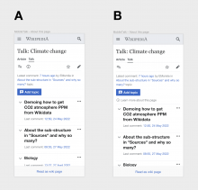
MobileTalk – About this page.png (1×736 px, 134 KB)
MobileTalk – About this page-1.png (1×736 px, 121 KB)
  • The About this page link that currently appears right beneath the talk page title ought to be:
    • Moved to appear beneath the Latest comment... indicator that – if present – will appear beneath the page tools bar (read: the row of icons for adding the talk page to your Watchlist, editing the talk page, etc.)
    • Revised so that the link reads ℹ Learn more about this page
      • Note: we ought to use the OOUI/Codex equivalent of the icon
  • The user will be able to tap on the ℹ Learn more about this page link to get access to a pop-up with relevant edit notices.

Open questions

Open Questions

  • 1. What should the copy for the link that exposes lead section content be?
  • 2. Are we combing the new "About this page" link location and treatment with the change in "Add topic" affordance?
    • No. This work will happen in T316175
  • 3. Where should the ℹ Learn more about this page link appear in the time before T316175 is implemented?

Done

  • An ===Approach is decided upon
  • ===Requirements are drafted
  • Web Team is consulted to ensure they are onboard with the approach we are proposing
  • ===Requirements are implemented

Background

T311760 introduced an interim solution for hiding talk pages' lead sections on the mobile site by "placing" it within the Read as wiki page view.

We think doing the above will increase the likelihood that people landing on talk pages will see the topic(s) being discussed on said page and subsequently, recognize the talk page as a place where volunteers communicate with one another about the edits they have made or are planning to make. [i]


i. Helping people to immediately recognize talk pages as containing conversations is a core objective of the Usability Improvements portion of the Talk Page Project.

Related Objects

StatusSubtypeAssignedTask
ResolvedNone
ResolvedBUG REPORTmatmarex
Resolvedmatmarex
Resolvedmatmarex
ResolvedJdlrobson
ResolvedNone
Resolvedppelberg
Resolvedppelberg
Resolvedppelberg
ResolvedDLynch
Resolvedmatmarex
Resolvedmatmarex
Resolvedmatmarex
ResolvedNone
ResolvedNone
OpenNone
Resolvedppelberg

Event Timeline

There are a very large number of changes, so older changes are hidden. Show Older Changes
nayoub removed nayoub as the assignee of this task.Aug 4 2022, 5:32 PM
nayoub moved this task from Doing to Ready to Be Worked On on the Editing-team (Kanban Board) board.
nayoub subscribed.

In this proposal, the lead section content is now above the topics with an "i" info icon and reads "Learn more about editing this page" (UX copy TBC).

The issue with this text—and almost any other text—is that the lead section may contain various types of content, of which the text you proposed applies to only one or a few:

  • WikiProject boxes
  • Talk page headers reminding users to remain civil and stay on topic
  • Links to archives
  • Templates or non-templated content describing the purpose of the talk page (mainly in project and project talk namespaces)
  • To-do lists
  • Notices about ArbCom decisions (article talk namespace)
  • Non-talk page contact methods (user talk namespace)
  • Property documentation and constraint templates (Wikidata’s Property talk namespace)
  • Discussions that were not properly formatted (e.g. missing heading and signature) and thus aren’t recognized as being discussions; this should become pretty rare as the New Topic Tool becomes default everywhere, but broken comments that are already there won’t disappear by themselves
  • etc.

The "Add topic" button is also moved to the bottom part of the UI, as a sticky footer

I don’t think we should add any sticky content on mobile—mobile screens are already quite small without us “stealing” even more space with sticky things.

Thanks for your comments @Tacsipacsi

1. Regarding the copy

The issue with this text—and almost any other text—is that the lead section may contain various types of content

We're converging towards "Learn more about this page" which is more user-friendly than the current "About this page" but still provides flexibility for multiple use cases as you outlined.

2. Sticky footer
We were thinking of replacing the sticky footer with a reveal-on-scroll which frees up the "real estate" of the mobile UI when needed but still provides the option for users to have the "Add topic" interaction handy when needed. This will be tackled in another ticket.

cc @ppelberg

Thanks for your comments @Tacsipacsi

1. Regarding the copy

The issue with this text—and almost any other text—is that the lead section may contain various types of content

We're converging towards "Learn more about this page" which is more user-friendly than the current "About this page" but still provides flexibility for multiple use cases as you outlined.

I've updated the task description to reflect this new copy.

Of course, @Tacsipacsi if there are issues you think the Learn more about this page copy could cause, please say as much.

2. Sticky footer
We were thinking of replacing the sticky footer with a reveal-on-scroll which frees up the "real estate" of the mobile UI when needed but still provides the option for users to have the "Add topic" interaction handy when needed. This will be tackled in another ticket.

@nayoub, ticket filed! We'll use T316175 to implement the revised Add topic button that appears on mobile talk pages.

With the above done, all that I think is left to do before engineering can work on this is you (Nico) answering the task description's remaining open question:

  • 3. Where should the ℹ Learn more about this page link appear in the time before T316175 is implemented?

noting that within "Advanced mode" on mobile we use "ⓘ Page information" to refer to the action=info page, e.g. https://en.m.wikipedia.org/w/index.php?title=Talk:Donna_Weiss&action=info

Screen Shot 2022-09-01 at 2.38.15 PM.png (1×790 px, 513 KB)

Building on what @alexhollender_WMF shared in T312309#8206776 , the next step is for @nayoub and I is to:

  • Decide whether we'll move forward with the approach we talked about offline to provide people access to talk page lead section content by way of an button within the page tools toolbar. See "Approach A" in the mockup @nayoub put together below.

image.png (1×1 px, 272 KB)

I'm assigning this task over to @nayoub to document the implementation we're moving forward with.

In the meantime, I've filed T316966 where we'll instrument the affordance this task will implement.

Just added the mocks and reviewed the reqs – looks all good. Moving this back to you @ppelberg :)

Change 836256 had a related patch set uploaded (by Esanders; author: Esanders):

[mediawiki/extensions/DiscussionTools@master] Add button to reveal lede section on mobile

https://gerrit.wikimedia.org/r/836256

Change 841493 had a related patch set uploaded (by Esanders; author: Esanders):

[mediawiki/skins/MinervaNeue@master] Disable "page issues" feature when DiscussionTools is handling talk page

https://gerrit.wikimedia.org/r/841493

nayoub moved this task from Design Review to QA on the Editing-team (Kanban Board) board.

Design QA
Looks great! Two observations:

  1. The "i" icon looks slightly different than the one on the mock but it's normal – the OOUI icon has been updated since then and the patch demo has the latest one.
  2. Not directly related to this task but the "add topic" button is missing the talk icon on this patch demo – is it normal since it's Patch Demo or a bug? @Esanders

→ Ready for QA on my end.

META
During today's team meeting we decided:

  1. Not to make any changes to how the notices that people will see if/when they tap the new ℹ Learn more about this page affordance.
    • In deciding the above, volunteers will have the ability to decide what – if any – adjustments they'd like to make to how these talk page notices appear on mobile talk pages where DiscussionTools are enabled.
  2. In line with the above, we're going make volunteers aware of the capacity they have to adjust how these talk page notices are styled/appear by announcing this change:

i. Potential language for Tech/News announcement; please adjust as you see fit: "On wikis where mobile DiscussionTools are enabled (see list), volunteers will soon have the ability to customize how talk page notices appear. See T312309 for more details.

i. Potential language for Tech/News announcement; please adjust as you see fit: "On wikis where mobile DiscussionTools are enabled (see list), volunteers will soon have the ability to customize how talk page notices appear. See T312309 for more details.

Question1: What exactly will editors be able to customize? That isn't clear (to me) in this proposed-wording, or task's-description, or the links.
Question2: When should it be included? (If Monday's edition, we need final-wording for the entry within ~24hours when it will be frozen for translation)
Thanks!

i. Potential language for Tech/News announcement; please adjust as you see fit: "On wikis where mobile DiscussionTools are enabled (see list), volunteers will soon have the ability to customize how talk page notices appear. See T312309 for more details.

Question1: What exactly will editors be able to customize? That isn't clear (to me) in this proposed-wording, or task's-description, or the links.

Great spot, @Quiddity! Volunteers will be able to customize how the page notices that can sometimes appear on talk pages will be styled for people. viewing them on mobile devices. [i]

Question2: When should it be included? (If Monday's edition, we need final-wording for the entry within ~24hours when it will be frozen for translation)
Thanks!

We're flexible! Including this announcement in the Tech/News that will go out the week of 17-Oct or 24-Oct both work for us. Whichever is easiest for y'all.


i. Please let me know if this wording is still too ambiguous and I'll ask a member of the Editing Engineering Team to offer more technical language.

Great spot, @Quiddity! Volunteers will be able to customize how the page notices that can sometimes appear on talk pages will be styled for people. viewing them on mobile devices. [i]
[...]
i. Please let me know if this wording is still too ambiguous and I'll ask a member of the Editing Engineering Team to offer more technical language.

@ppelberg More technical details would be great, please and thanks! I'll postpone/plan the Tech News entry for the 24-Oct week, so that we can get this right, and perhaps update any onwiki docs as needed, too. :)
To be clear, and offer my interpretations, I'm uncertain whether editors are being informed that
(A) they will soon be able to style:

  • All instances (i.e. site-wide only) of the string ℹ Learn more about this page.
    • Individual instances of the string ℹ Learn more about this page. (e.g. Unique styling on the page w:en:talk:Homeopathy?)
  • All instances (i.e. site-wide only) of the box that appears when someone clicks the new string.
    • Individual instances of the box that appears […]
  • The contents within the box. (IIUC it's usually {{Tmbox}} content, but it likely varies at some wikis)
  • combinations of the above.
  • something else entirely!

(B) Where and How they would style [A]'s answer. (Plus, perhaps linking to an example, in the onwiki-docs?)
Thanks!

We are just referring to the fact that things like tmbox could have their stylesheets modified (via TemplateStyles) to render better on mobile/narrow devices. This could be done using a selector (.skin-minerva or mw-mf) or a viewport width media query.

  1. Content & links - Is there anything we could link to (docs onwiki? or example-diffs in the Description here?), in order to explain this context?

I.e. I think this would be a good entry, but it needs a target for the "LINK"

On wikis where mobile DiscussionTools are enabled (see list), editors will soon be able to customize how talk page notices appear. You can now add mobile-specific CSS to standard talkpage-header templates. See [docs/examples] at [LINK]. [ 1 ]

  1. Timing - Do you want this announced either
    • ahead-of-time (in either the "Changes this week" section or the "Future changes" section), or
      • Editors would need to remember to check back later.
    • only once it is available. (When will it be available?).
      • Editors would be able to experiment/implement changes immediately.

I suggest the latter, if there's not an implicit/explicit request for pre-deployment feedback.

We are just referring to the fact that things like tmbox could have their stylesheets modified (via TemplateStyles) to render better on mobile/narrow devices. This could be done using a selector (.skin-minerva or mw-mf) or a viewport width media query.

Selecting by skin or MobileFrontend is generally an anti pattern as there are more skins than Minerva on MobileFrontend to support on narrow devices (Monobook, Timeless, and maybe in some future Vector 2022). I have done a chunk of work on this in the past few years as a result of using Timeless and finding problem children. I would explicitly recommend a media query here, with an "if you really need to workaround some style being added by those specific environments" type of reference to the other selectors that might indicate something is in a mobile context. Regardless of course, I'd recommend a page documenting that, possibly with some see also link to existing recommendations. (Or perhaps just modify that page?)

Coincidentally, on English Wikipedia, tmboxes (and other Module:Message boxes) now display at full width below 720px and have since a few months. I expect other wikis to follow but I don't know how many have been actively working on removing manual uses of the relevant classes to enable TemplateStyles (and remove styles from Common.css/Mobile.css). (Representative tracking of the effort that took a solid chunk of time; you can see the numbers going down in the page history mostly as a result of work on this account and the IznoRepeat account.)

On English Wikipedia, from a tmbox-control view, dealing with the images left/right inside .tmbox-image(right) are probably the only other things that could be worked on for mobile display presentation. I've been blocked on weariness grounds on working on those since I think that should be part of converting things away from tables to flex first and I know I'm going to find more problem children. From a per-template view, we can probably work on supporting .hide-when-compact in tmbox or similar, but that will of course require modifications in the same way it was required for .ambox things several years ago, and I'm not sure of the best way to do that since it's not quite the same use case as .ambox was since tmbox won't have a modal like MobileFrontend provides. (Gadgets like TheDJ's responsive gadget are enabled by it, so it might be valuable regardless.)

@Quiddity Based on what @Izno has said above, I think something like:

On wikis where mobile DiscussionTools are enabled (see list), we will soon be showing talk page notices with full styling. To customize the layout of talk pages boxes on narrow mobile devices you can use media queries, example: https://en.wikipedia.org/wiki/Module:Message_box/tmbox.css

That seems good to me! Thanks.
What about the timing? (cf. #2 in T312309#8323341 above)

Change 841493 merged by jenkins-bot:

[mediawiki/skins/MinervaNeue@master] Disable "page issues" feature when DiscussionTools is handling talk page

https://gerrit.wikimedia.org/r/841493

Change 836256 merged by jenkins-bot:

[mediawiki/extensions/DiscussionTools@master] Add button to reveal lede section on mobile

https://gerrit.wikimedia.org/r/836256

Known issues:

  • When the lede section contains reply buttons, you can still use them from the popup, which mostly works but it's buggy in funny ways. I'm not sure what we should do about it. What if we just displayed the lede section normally, like in articles, if it contained any comments?
  • Table of contents is always hidden together with the lede section (proposed replacement: T321618 / T322628)

Added to next week's Tech News in the "Future changes" section. Please edit within ~22 hours if any tweaks are needed.

The interface looks good to me. However, there are some issues with the way it behaves for the special case: when a talk page has a lede section that contains Reply buttons as @matmarex mentioned below:

Known issues:

  • When the lede section contains reply buttons, you can still use them from the popup, which mostly works but it's buggy in funny ways. I'm not sure what we should do about it. What if we just displayed the lede section normally, like in articles, if it contained any comments?
  • Table of contents is always hidden together with the lede section (proposed replacement: T321618 / T322628)

The issues are:

  1. When you click on the Reply link from within this new pop-up, it doesn't scroll all the way down to the bottom of the pop-up where the Reply tool has opened.
  1. Once you post a reply from within this pop-up, it doesn't show the newly posted comment in the same session unless you refresh the page and click on ℹ Learn more about this page and re-open this pop-up.
  1. Also after posting a comment from within this pop-up, the Reply tool doesn't open the next time. If you click on it, it throws the following JS error:
Uncaught TypeError: Cannot read properties of null (reading 'ownerDocument')

Next steps

Added to next week's Tech News in the "Future changes" section. Please edit within ~22 hours if any tweaks are needed.

The language you drafted looked accurate and clear [i], @Quiddity – thank you for making this happen..

Meta: I'm sorry you didn't hear back from us until after-the-fact. Going forward, I'll be sure to share feedback about announcement language before Tech/News rolls out.


i. Wikis where mobile DiscussionTools are enabled (these ones) will soon use full CSS styling to display any templates that are placed at the top of talk pages. To adapt these “talk page boxes” for narrow mobile devices you can use media queries, such as in this example. [4]

@ppelberg Appreciated!
I should note that an editor was confused by the initial language we drafted above, so after discussion on the talkpage they helped to clarify the final version that was sent. :-)

@ppelberg Appreciated!
I should note that an editor was confused by the initial language we drafted above, so after discussion on the talkpage they helped to clarify the final version that was sent. :-)

Gotcha, ok! Seeing the delta between the language we drafted and what ended up being easier for people to understand is helpful for next time.

ppelberg claimed this task.

Next steps

Filed T324139

Test wiki on Patch demo by ESanders (WMF) using patch(es) linked to this task was deleted:

https://patchdemo.wmflabs.org/wikis/91b554c5d1/w/